Automated Brand-Consistent Image Pipeline: 8-Step Implementation

Most teams treat visuals like frosting. Nice to have. Add at the end. Then a random stock photo sneaks into a product story and… you feel it. The narrative says “enterprise-grade,” but the hero image whispers “template.” That tiny mismatch steals trust on contact. It’s not a design nuance. It’s a system problem.
I learned this the hard way. Back when we were shipping fast, we’d grab something passable to keep the calendar moving. Looked fine in preview. Then sales asked, “Do we have a screenshot here instead?” Because prospects want to see the product, not an abstract swirl. You fix the image, the publish slips, and the cost hides in rework no one budgets for.
Key Takeaways:
- Treat visuals as governed outputs; encode brand, placement, and QA rules in the pipeline
- Prompts alone don’t create consistency—deterministic rules and libraries do
- Inconsistent visuals reduce trust, sap conversion, and introduce hidden rework costs
- Standardize formats, filenames, and alt text to protect accessibility and performance
- Build an eight-step image pipeline that removes randomness end to end
- Use automation to place product screenshots where they matter—especially in solution sections
Visual Inconsistency Is Not Aesthetic, It Breaks Trust
Visual inconsistency erodes credibility because design is part of the message, not separate from it. Audiences form opinions in seconds, and off-brand imagery creates cognitive dissonance with your copy. Think “modern security platform” paired with a dated graphic—your reader can’t unsee the mismatch.

Why visuals are not decoration
Visuals either reinforce your narrative or fight it. When a product story lands with stock abstractions, readers subconsciously discount the claims. Consistency isn’t vanity; it’s a signal: you run a tight ship. That signal shows up in bounce rates, demo intent, and the tone of sales conversations.
I’ve watched great copy underperform because the pictures didn’t carry the weight. The fix isn’t “nicer images” or more design cycles. The fix is deciding what “on-brand” means in a way a system can execute: colors, marks, styles, aspect ratios, where screenshots should appear, and what “pass” looks like. Then you apply those rules every time.
There’s research to back the first-impressions point. Design drives trust in milliseconds, which means you don’t get a redo at the top of the page. If the hero looks off, the message takes a hit. That’s why consistency beats novelty for brand content. See the pattern in the wild: leaders use fewer, better visual patterns repeatedly, and it works. For a broader view on first-impressions and credibility, NN/g’s research on design-driven trust is worth a skim.
What conventional image workflows miss
Conventional flows chase aesthetics, not outcomes. You make a draft, hunt for a hero, resize at the end, and negotiate “good enough” when deadlines crowd the calendar. None of that encodes a rule. So every new article starts at zero, and every deviation compounds over time.
Here’s the rub. One-off prompts can generate beautiful images. They don’t remember your brand tokens, your logo safe area, or where product screenshots must sit. Designers become the safety net, sanity-checking every edge case. That’s fine at 4 posts a month. At 40, it’s a bottleneck you can feel.
Replace taste-based steps with rules in code. Decide once: how many visuals per template, which sections get screenshots, acceptable background contrasts, minimum resolution, and filename structure. Decisions move upstream. Variability drops. Publishing gets boring in the best way.
What happens when visuals drift off brand?
You ship faster, but drift eats the story. Sales starts asking for proof—screenshots and flows—because conceptual art isn’t persuading anyone. Readers aren’t angry; they’re just unconvinced. It’s a credibility tax you pay quietly.
The better approach isn’t adding more reviewers. It’s a governed pipeline. Asset libraries are authoritative. Placement rules are deterministic. Generators pull brand tokens and style refs by default. QA gates block publishes that don’t meet a minimum score. That’s how you keep pace without fraying the brand.
You’ll notice something else. Teams stop arguing about taste. They argue about rules. And that’s productive. Update the rule once, apply it everywhere. The creative energy goes back into story, not fixing crops or filenames.
Ready to see this approach beyond theory? If you want a quick sense of the end state, Generate 3 Free Test Articles and look closely at how images align to the narrative.
The Real Bottleneck Is Governance, Not Generation Speed
The bottleneck isn’t how fast you make images; it’s whether your system makes the same quality decision every time. Speed without rules magnifies inconsistency. Speed with governance compounds trust because your outputs match your intent—even on a bad day or a busy week.

What traditional approaches miss
Traditional pipelines treat metadata and placement as afterthoughts. You’ll see lovely images paired with the wrong section. Alt text written in a rush. Filenames like image1-final-final.webp. It “works,” but it doesn’t scale. And it’s hard to debug because there’s no definition of done beyond “looks fine.”
Governance is decisions made explicit and executable. Which assets are valid? Where do they go? What wins a tie between two screenshots? What constitutes pass/fail? Write it down. Then make the system enforce it. Your team executes the narrative. The machine enforces structure.
When you do this, you stop relying on heroics. The pipeline carries the load, and people contribute where it matters—clarifying product value, sharpening examples, and telling better stories.
Why prompts alone cannot carry your brand
Prompts are instructions for one moment. Brands are systems that persist. Without a brand library, template scaffolds, and deterministic placement, you’ll get impressive images that don’t advance your message. That dissonance is subtle, but readers feel it.
You want prompts that reference brand palettes, logo marks, and style refs. You want templates that constrain composition and typography. You want placement rules that dictate “Hero after title. First inline before the third H2. Screenshots in solution sections by priority.” That’s what transforms prompts from art to evidence.
Short version: prompts without rules produce variance. Prompts backed by rules produce identity.
How do on-brand visuals become a system?
Eight moves get you there: a governed brand library, deterministic placement, a tagging schema, prompt scaffolds, semantic screenshot matching, standardized renders, a QA gate, and a safe deployment loop. Each step removes a source of randomness. Together they create reliable output.
I’ve seen teams try to skip straight to templates. Works for a month. Then a product release ships, the screenshots lag, and the gaps show up. You need the whole chain. It’s simpler than it sounds when you implement it as code.
As a sanity check, treat every decision like it needs to be enforced by a machine at 2 a.m. If it can’t be enforced, it isn’t real governance yet.
For the performance side of imagery (formats, loading, layout), Google’s guidance on Largest Contentful Paint (LCP) is a solid reference for why aspect ratios and sizes metadata matter.
The Hidden Costs Of Ad-Hoc Imagery In Production
Ad-hoc imagery creates silent taxes: editing time, page performance debt, and conversion leakage. You won’t see a neat line item in a dashboard, but the team will feel it in slipped deadlines and softer pipeline. Those minutes and missed opportunities compound over months.
Engineering hours lost to rework and fire drills
Let’s pretend you ship 30 posts a month. Two hours per post to chase a hero, resize, rename, and fix alt text is 60 hours. Miss a brand element, burn another afternoon in edits. Multiply by 12 months. Now ask if those hours were intended for image cleanup or product.
This is where governance pays dividends. Alt text templates seeded by section summaries remove guesswork. Filenames follow a pattern, not preferences. Aspect ratios render from rules, not eyeballs. You trade reactive editing for proactive structure, and the calendar breathes again.
I’ve seen the opposite: late-stage back-and-forth on “can we try another hero?” for a piece that should have shipped days ago. Not a design problem. A process problem.
The cascading impact on SEO and accessibility
Missing alt text reduces accessibility and leaves search context on the table. Generic filenames do the same. Inconsistent aspect ratios trigger layout shifts, which can hurt LCP. Individually, these look small. Together, they nudge performance and perception in the wrong direction.
If you want a simple standard to enforce, start with accessibility. The W3C WAI decision tree for alt text clarifies what good looks like. Then add performance hygiene: modern formats, srcset, and sizes metadata. Google’s guidance on serving images in modern formats is a clear, practical baseline.
Standardizing this once saves weeks of invisible cleanup across a year. Your developers will thank you.
What does inconsistency cost per quarter?
Let’s pretend a benchmark: when visuals are product-first and on-brand, an average article generates 10 demo requests a month. Off-brand or generic visuals reduce that by even 20 percent. Across 90 posts in a quarter, you’ve muted demand for reasons no attribution model captures cleanly.
You won’t always spot it in Google Analytics. You’ll hear it on calls. “Do you have a screenshot of that?” “Where can I see it in the UI?” When those questions show up too often, visuals aren’t doing their job.
Still wrestling with this manually? It might be time to change the workflow, not work harder. Use An Autonomous Content Engine and move these rules into code.
The Frustration Of Shipping Articles That Do Not Look Like Your Brand
This is the emotional tax: embarrassment, rollbacks, and distractions from the real work. When visuals miss the mark, the brand takes the hit first, the team shortly after. It’s fixable, and it starts by moving checks before publish, not after.
The late-night rollback you did not plan for
A hero ships off-brand. A partner flags it. You roll back. Editorial slips, URLs change, and the team loses a day of momentum. It’s avoidable. Encode brand checks before publish. If a visual fails the gate, it doesn’t ship. No debates at 10 p.m.
I’ve been there. You think, “It’s just one image.” Then the post propagates, a few newsletters pick it up, and the correction becomes its own project. A gate with clear pass/fail criteria removes those surprises.
Set the rule once. Honor it always. Sleep better.
When your best customer asks if you changed your brand
It stings. A customer forwards a link, “New look?” Translation: “Something felt off.” That’s not stylistic feedback; it’s a trust signal waving a small flag. Readers should think about your solution, not your template decisions.
The antidote is boring consistency in the best sense. Repeatable patterns. Predictable compositions. Screenshots where they belong. You want recognition to be instant, not negotiated.
Small note: this doesn’t kill creativity. It contains it to safe lanes.
Why does this keep happening on deadline?
Because design becomes the last mile under pressure. People are busy, shortcuts appear, and “just this once” sneaks into the culture. The pattern repeats until you codify the rules and make them non-optional.
Move decisions upstream. Placement, colors, marks—put them in code. Add a score threshold that blocks publishes. Normalize it as the cost of doing it right, not a hurdle to clear. The result is fewer apologies and more confident launches.
If you need a reference point for gating decisions, there are strong, practical models for quality gates in content pipelines. The principle is the same: define the bar, enforce it every time.
A Production-Ready Approach To Automated, On-Brand Images
A production-ready image pipeline combines brand rules, deterministic placement, semantic matching, and gated quality. The goal is fewer choices at publish time and more consistency at scale. Eight steps cover the ground: from asset library to safe rollout, each one reducing randomness.
Step 1: Audit And Structure Your Brand Asset Library
Centralize palettes, logos, style references, and product screenshots into a governed library with versioning. Add brand tokens—primary_hex, secondary_hex, gradient_name, logo_safe_area—so templates can reference them deterministically. Require usage constraints and exclusion zones so nothing gets stretched, cropped, or recolored in ways that fracture identity.
Treat this as the source of truth. If it isn’t in the library, it doesn’t ship. That clarity helps every downstream decision. You’ll also make updates faster. Swap a logo variant once; the system pulls the right asset everywhere it’s needed.
A final note: capture section-specific screenshot candidates during product work, not after. You’ll save yourself the scavenger hunt later.
Step 2: Define Deterministic Placement Rules
Decide where the hero goes and where inline visuals appear. For example: Hero after the title. First inline before the third H2. Screenshots prioritized in solution sections. Encode counts per template: 1 hero, 2–3 inlines. Block duplicates by rule, not review.
This resolves 80 percent of the “where should this go?” debate upfront. It also stabilizes layout performance across devices. Consistent visual positions mean more predictable reading patterns and fewer layout shifts.
Once you live with rules, you won’t miss the case-by-case guessing.
Step 3: Implement A Tagging Taxonomy And Metadata Schema
Create a schema for assets and screenshots: topic_cluster, product_feature, ui_element, aspect_ratio, min_resolution, alt_text_template, brand_match_weight. Tag screenshots with feature and benefit keywords. Include product release versions. This becomes your matching substrate.
The stricter the schema, the smarter your placement. It also creates explainability. When someone asks, “Why did this screenshot land here?” you can point to tags and thresholds, not taste.
Schema work feels slow. It’s leverage.
Step 4: Build Generation Templates And Prompt Scaffolds
Design prompt scaffolds that inject brand tokens deterministically: {primary_hex}, {logo_mark}, {style_ref_url}, {background_texture}, {brand_descriptor}. Maintain templates for hero, inline conceptual, and simple diagrams. Use negative prompts for banned motifs. Keep variations tight to avoid drift.
Prompts become boring in the right way—stable, predictable, and grounded in your library. This reduces “do we like this style?” debates and concentrates feedback on narrative fit.
Templates don’t kill creativity. They focus it.
Step 5: Implement Semantic Screenshot Matching
Select an embedding model, define similarity thresholds, and map paragraph vectors to screenshot tags. Prioritize solution sections when multiple screenshots qualify. Add fallbacks: if no screenshot passes, generate an on-brand inline instead. Log matches with scores and reasons for auditability.
The goal isn’t to be fancy. It’s to be explainable. You want to know why a screenshot appeared, not guess. This also nudges more product-first visuals where they convert best: near your solution narrative.
Matching reveals gaps in your library. Good. Fill them.
Step 6: Standardize Rendering, Formats, And Responsive Output
Render required aspect ratios—16:9 hero, 4:3 inline, 1:1 social, and 9:16 when needed. Output AVIF and WebP with sensible quality caps. Generate srcset and sizes metadata. Use descriptive filenames like brand-keyword-topic-variant.webp. Pre-generate alt text from templates seeded by section summaries and brand terms.
This protects performance and accessibility. It also ends late-stage “can you re-export this at 1200px?” pings. For practical guidance on modern formats and responsive patterns, Google’s playbooks on serving images in modern formats are concise and actionable.
Make the right thing the default. Manual re-exports should be extinct.
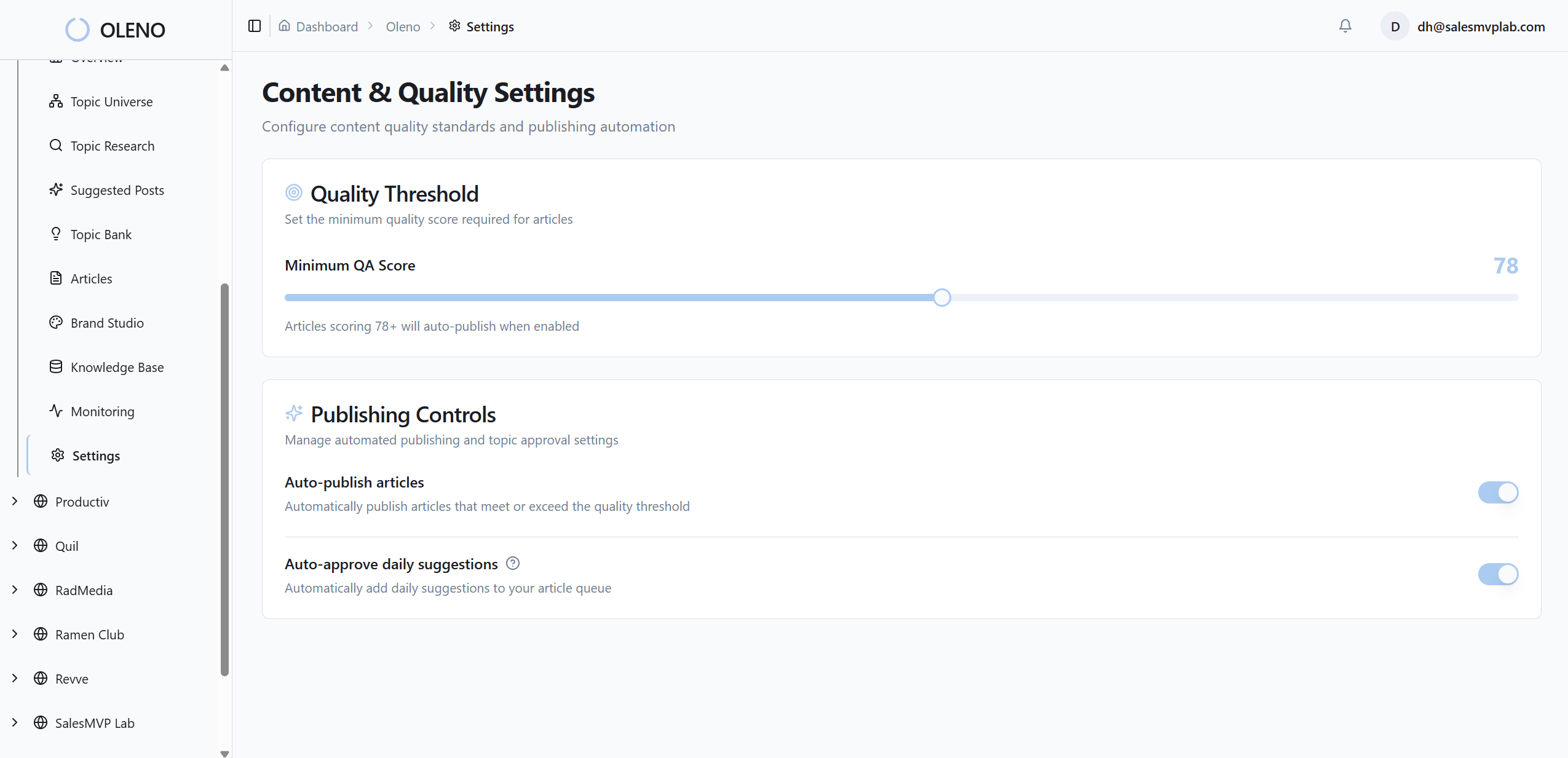
Step 7: Add A QA Gate With Pass-Fail Criteria
Score brand match, composition, contrast ratio, alt-text completeness, and filename structure. Set a minimum passing score—say 85. Failures trigger auto-regeneration or screenshot substitution, not a publish. Record every failure reason so you can improve templates and thresholds deliberately.
You can’t debate your way to consistency at scale. You can only gate it. This step separates “we hope it’s on-brand” from “we know it won’t publish unless it is.”
Treat the gate as a guardrail, not a wall.
Step 8: Deploy Safely, Monitor, And Iterate
Roll out changes gradually. Start at 5 percent, then 10, then 50. Log pipeline inputs, outputs, and gate scores. Send debounced notifications for failures. Keep a rollback lever and versioned configs. Review drift weekly. Adjust thresholds and templates based on logs, not hunches.
Small, stable releases beat big swings. Over time, the system tightens. The workload shrinks. Confidence grows.
One interruption: write down your rollback plan before you need it.
How Oleno Operationalizes This Image Pipeline End To End
Oleno operationalizes this approach by turning each step into a deterministic capability: governed assets, rule-based placement, semantic matching, standardized renders, and a quality gate that blocks bad publishes. You get consistency without micromanaging every article or image request.
Visual Studio uses your Brand Asset Library
Oleno’s Visual Studio pulls your colors, marks, style references, and tagged screenshots to generate on-brand heroes and inlines. It references templates and brand tokens, not vibes. Product screenshots are sourced from your library and aligned to sections that need proof, not decoration.

The benefit is straightforward: fewer last-minute design handoffs, less drift, and clearer product context. The system pushes brand-first visuals by default so your story lands as intended.
When your library updates, Visual Studio updates with it. No manual backfill.
Deterministic placement and semantic screenshot matching
Oleno places images intentionally using rules. Screenshots are matched to relevant sections with semantic similarity, and solution sections are prioritized when there’s a tie. This closes the common gap between “we described the product” and “we showed it.”
It’s also explainable. Placement happens because the rules say so, with thresholds and reasons you can audit. That builds trust with your team—creative leads know the system isn’t freelancing, it’s enforcing.
This pattern aligns directly with the costs we walked through: fewer rework loops, stronger context, better conversion signals.
Automated alt text, filenames, and responsive renders
Oleno generates SEO-friendly filenames and alt text automatically, sized to the section and grounded in the narrative. It renders multiple aspect ratios and resolutions—AVIF and WebP included—so performance and accessibility are covered without manual steps.

Developers stop re-exporting assets. Editors stop inventing filenames. Accessibility isn’t a “we’ll add it later” task; it’s baked in. Those quiet hours you used to lose? You get them back.
This is structure doing real work for you.
QA gate and no-publish fail safes
Every article runs through an 80-plus-criteria QA gate that includes visual placement and consistency checks. Low-scoring areas trigger refinement loops. Below-threshold visuals don’t ship. Oleno treats quality as a system, not a sprint before publish.

This ties back to the hidden costs. No more late-night rollbacks. No more “we’ll fix the hero next week.” The gate prevents those scenarios by design. And because passes and failures are logged, you improve the pipeline—not just patch today’s post.
If you’re ready to move this from theory to practice, Oleno makes it easy to test the full pipeline with your brand inputs. Try Oleno For Free and see governed visuals, not one-off art.
Conclusion
Here’s the simple truth. You don’t beat inconsistency with taste or speed. You beat it with rules you can execute automatically, every time. When visuals are governed—assets, placement, matching, renders, QA—the story lands cleaner, performance holds up, and conversion friction drops. You stop debating images and get back to the message. That’s the point.
About Daniel Hebert
I'm the founder of Oleno, SalesMVP Lab, and yourLumira. Been working in B2B SaaS in both sales and marketing leadership for 13+ years. I specialize in building revenue engines from the ground up. Over the years, I've codified writing frameworks, which are now powering Oleno.
Frequently Asked Questions