Behavioral Science Tactics: Boost Content-to-Lead Conversions 30% in 6 Weeks

Traffic without conversions looks impressive in a dashboard and useless in a pipeline. I’ve lived both. At Proposify, we ranked for a ton of keywords. Traffic was up and to the right, yet sales complained that leads felt off. The content had personality, but it wasn’t anchored to the product or a clear action path. That gap is where the money leaks.
When I was the only marketer at PostBeyond, I could crank out 3 to 4 strong posts per week. That worked until I lost time to exec meetings and the new writer didn’t have my context. Quality slipped, we got slower, and the conversion curve flattened. The lesson stuck. Volume isn’t the lever. Behavioral design in the workflow is.
Key Takeaways:
- Treat behavioral design as part of your brief, not a post-publish tweak
- Build a micro-conversion ladder that moves people from safe yes to form completion
- Kill friction you can’t see: fields, navigation, cognitive load, and latency
- Ship low-cost experiments weekly and freeze what wins into templates
- Encode micro-CTAs, friction checks, and copy patterns into your QA gate
- Small teams don’t need headcount for lift, they need rules that run every week
Traffic Without Conversions Means The System Is Failing Quietly
Traffic without conversions means your system is optimizing the wrong thing. Behavioral design belongs in your input layer, briefs and QA, not as a late-stage patch. When micro-commitments and friction checks live in templates, writers apply them every time, like muscle memory.

Why behavioral design belongs in your brief
You don’t move conversion by begging for bigger campaigns. You move it by putting the right prompts in the right places, every single time. Micro-commitments, friction audits, persuasive triggers. Make them required fields in your brief. Make them visible and easy to check during review. That’s how you prevent drift when multiple people touch the work.
I like to think of it like sales process. When discovery questions live in reps’ heads, discovery is inconsistent and conversion dips. When questions live in the CRM as required fields, the process shows up in every call. Briefs and QA play that role for content. You force the right asks at the right time, then block publish if friction sneaks back in. Over six weeks, this compounds.
What most teams get wrong about conversion lift
Most teams tack on last-minute “conversion hacks” after a draft is finished. Too late. The story is set, the structure is fixed, and you’re wedging a demo button into a paragraph about theory. Of course it underperforms. You want inputs and gates, not ad hoc edits. Inputs are your templates and pre-wireframes. Gates are your QA checks that catch regressions before anything goes live.
Two simple patterns change the curve. First, force a micro-CTA in the first screen. Not a “book a demo,” a safe yes that earns the next click. Second, enforce copy patterns that remove cognitive load. No nested modals. No competing primary buttons. No walls of text with no breathing room. When these are rules, not reminders, conversion stops slipping week to week.
Ready to skip the theory and see it configured end to end? Request a short walk-through. Request A Demo
Build A Micro‑Conversion Ladder That Actually Leads To A Form Fill
A micro-conversion ladder is the path from a low-risk click to a value exchange to a form completion. Each rung reduces uncertainty and increases commitment by a small amount. You map it once, attach it to your brief, and reuse it across articles and channels. That’s how you turn traffic into momentum, not bounces.

What is a micro-conversion ladder and why it matters?
Think of the last time you filled out a form for a tool you didn’t know well. You probably didn’t jump straight to “Talk To Sales.” You wanted to preview the value, lower the risk, and see your use case represented. A micro-conversion ladder honors that. It gives readers safe steps, each with a clear payoff.
A typical sequence looks like this. Read 30 percent of the article. Click an inline explainer that matches your role. Choose a use-case path that changes the examples and copy. Unlock a template with one field. Then, when trust is earned, complete a short form to get a deeper asset or start a trial. Each step makes the next request feel reasonable. Document this ladder in your brief, so every piece has a designed path, not a guess.
Map view to value exchange to form completion
Draw three columns in your brief and fill them before anyone writes. Column A is content moments: headline, opening, first scroll, inline example, tl;dr, conclusion. Column B is the micro-commitment: select a role, toggle an example, save a checklist, expand a use-case card. Column C is the value exchange: role-specific examples, downloadable template, calculator result, starter pack.
Keep early asks tiny. Don’t jump from “hello” to “phone number.” The form becomes a logical end of the ladder, not a surprise. You also gain testing leverage. If a piece underperforms, you can change a rung without touching the whole article. That’s a small fix with outsized payoff for a lean team.
The Hidden Cost You Pay Every Week To Friction You Do Not See
Friction hides in places that don’t scream at you in a meeting. Form fields, navigation, cognitive load, and latency compound into abandonment. You can’t fix what you don’t see, so name the buckets and audit them weekly. Your existing traffic will perform better before you spend on more.
The four friction sources that kill intent
There are four buckets I check on every page. Form fields, are you asking for job title, phone, and budget before trust exists. Navigation, do your links pull people away from the intended path at the exact wrong moment. Cognitive load, long paragraphs and competing CTAs stall action and create analysis paralysis. Latency, slow pages break the flow and reset attention.
Fix the loudest two first. A long form at the wrong moment? Defer it. Conflicting CTAs in the hero and the sidebar? Pick one primary and align the rest. Writers and designers don’t always see these as conversion killers because they’re buried in the experience. Make them a checklist item in QA. For latency, basic Core Web Vitals work matters. If LCP is poor, you’re bleeding intent before copy even gets read. See Largest Contentful Paint (LCP) for the thresholds that influence perceived speed.
Let’s pretend your abandonment is 65 percent on forms
Run a simple scenario so the team feels the cost. Say a page gets 1,000 visits in a week, drives 80 primary CTA clicks, and 20 form starts. Only 7 complete. That’s a 65 percent abandonment rate on the form. If you improve completion by 20 percent, you get 8 to 9 extra leads that week. No new spend. No new traffic.
Over six weeks, that’s 50 or so more leads. Not heroic, just disciplined. And those leads are closer to fit because they made it through a ladder that screened for intent. If you want a reference for how small effects add up, see this peer‑reviewed research on cumulative behavioral effects. The compounding is real.
Why does more traffic make this worse, not better?
More traffic multiplies the cost of your leak. If your forms scare people off, buying ads or chasing new keywords just feeds a broken pipe. That’s why the first job isn’t “get more eyeballs.” It’s “reduce friction and add safe yes steps.” Once the path works, then scale traffic so you’re amplifying a working system.
I’ve watched teams celebrate a traffic spike in Slack, then whisper about the same pipeline number in the forecast review. It’s a bad feeling. Flip the order. Fix the path, encode the steps, and your traffic will start doing real work for you.
Still dealing with abandonment and low intent even as traffic grows? There’s a faster way to tighten the system. Request A Demo
When Buyers Try To Act But Your Experience Says Not Today
Buyers don’t fail to convert because they’re lazy. They fail when your experience makes action feel risky or expensive. Think about slow modals, nine required fields, or a vague “Book A Demo” ask with no context. Those are preventable losses that show up in your pipeline.
The 3 am realization when your best prospect bounced
Story time. You see a high-intent company in your analytics. They clicked the primary CTA. Then nothing. You replay the flow and notice a three-second modal delay, then nine required fields with two that feel intrusive. Budget and phone. They bounced. Was the product wrong, or did the page say “not today.”
Put a low-friction save and continue option up front. Or a one-field capture that sends the asset they came for. Give a reason to stay. If someone is signaling intent, don’t make them earn the right to talk to you with an interrogation. Make it easy to say yes, then invite a bigger step later when trust exists.
What if the copy asked for less, earlier?
Language matters. Instead of “Book A Demo,” try “Get The Template We Use” with one field, or “See The 3-Step Onboarding We Recommend.” Instead of “Subscribe,” try “Send Me The Checklist I Just Read.” The framing reduces perceived cost and matches the moment. You earn the right to ask for more when the reader feels you’ve already delivered.
We saw this when we swapped a generic CTA for a role‑specific micro‑ask on a high‑traffic explainer. No new traffic. Same article. Completion ticked up because the ask was safer and the payoff was obvious. You can do this in a week and bake the winner into your template.
Put Behavioral Design Inside The Workflow, Not After Publish
Behavioral design works when it’s part of how work gets done. That means templates, ready-to-use copy blocks, a friction audit in QA, and a weekly experiment cadence. Speed without structure creates noise. Structure with simple rules creates lift.
Embed three micro-commitment patterns with ready-to-use copy
Give writers blocks they can drop in without debate. Three I like: progressive disclosure, low-friction signup, and value-first interactions. Progressive disclosure reduces overwhelm by revealing steps after a single click. Copy looks like, “Choose your role to see examples for you.” It’s anchored in Hick’s Law, fewer choices reduce decision time and perceived effort.
Low-friction signup is a one-field capture with a clear payoff. “Email me the calculator and two usage tips.” Value-first interactions let readers try before committing. “Try the estimator, no email yet.” Put these as reusable blocks in your brief so the same patterns show up across writers, pages, and channels. Consistency turns into data you can trust.
Run a fast friction audit and remove two to four blockers
Create a 12-minute checklist that lives inside your QA gate. Count required form fields and push anything non-essential to later. Scan for conflicting CTAs and demote or remove the extras. Check LCP and TTFB to catch obvious latency issues. Review paragraph size and jargon density to lower cognitive load.
Then fix what you can in the draft and log what you can’t as backlog bugs. The point isn’t one perfect page. It’s steady removal. Every blocker you remove today makes the next hundred visitors more likely to act. When that audit is part of your definition of done, regressions get caught before they cost you.
Use persuasive triggers responsibly, with context and limits
Persuasion works best when it reduces risk, not when it manipulates. Social proof should live near risk points, not just the hero. A quote next to a form can reduce anxiety better than a logo farm up top. Defaults can guide, pre-select the most common option but make the change path obvious. Risk reversal can be a simple “no credit card for trial” or “cancel anytime” line where fear spikes.
Scarcity? Use it only when it’s real. Document where each trigger belongs in your template, so you don’t overuse them and numb your audience. This isn’t about tricks. It’s about lowering the cost of action in a way that respects the reader’s intent.
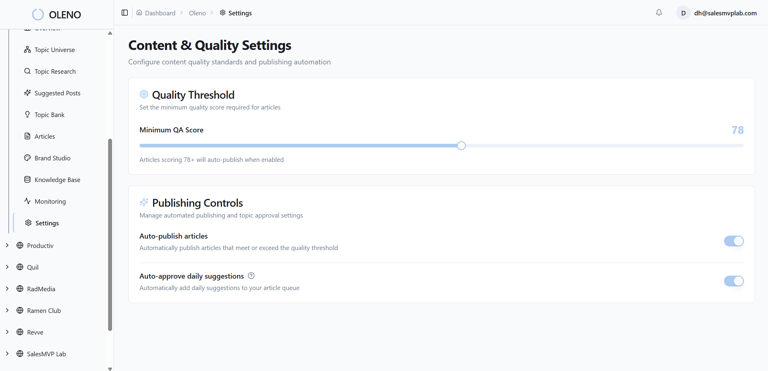
How Oleno Enforces Behavioral Design Across Briefs And Publishing
Small teams don’t win by out-writing or out-spending. They win by encoding the right rules into the system so quality and conversion don’t depend on heroics. Oleno does this by turning behavioral design into inputs and gates that run every day, not reminders that get ignored.
Brief templates that lock in micro-commitments
With Oleno, you define brief fields for micro‑CTAs, value exchanges, and persuasive triggers. You set CTA style and placement rules at the brand layer so the asks show up in the right moments by default. Writers don’t guess, and reviewers don’t have to chase the same fixes across drafts. That consistency reduces frustrating rework when deadlines are tight.

Oleno keeps the brief opinionated without being rigid. You can tailor patterns by job, like programmatic SEO versus a product explainer, and still carry the same behavioral ladder across both. The benefit is a coherent experience that builds trust while earning the next step.
QA gates that prevent friction regressions
Oleno enforces quality before anything publishes. The QA gate checks structure, voice, narrative, and technical health. You can add friction checks like paragraph size limits, banned copy patterns, and flags for conflicting CTAs. Nothing goes live until it passes. That means a hard-won fix doesn’t get undone in the next draft or by the next writer.
Over time, this lowers coordination cost. You spend less energy policing and more time designing better ladders. And because Oleno runs the same checks every time, the system becomes reliable. Reliability is what creates the compounding.
Publishing cadence that makes experiments routine
Oleno runs a deterministic pipeline from Discover to Publish. CMS publishing supports idempotency and retries, so drafts don’t pile up and duplicates don’t sneak in. You can cadence weekly tests, pool pages when traffic is low, and keep the primary metric clear, usually form completion rate with micro‑CTA clicks as a secondary.

When a variant wins, Oleno makes it easy to freeze the pattern in your template so it shows up next week without a meeting. That is how a small team keeps shipping and stops resetting to zero every quarter. You set the rules once. Oleno runs the system.
If you want to see how these brief fields, QA checks, and publishing steps hang together in practice, we can walk through a live setup. Request A Demo
Conclusion
You don’t need more traffic to lift conversions in six weeks. You need a micro‑conversion ladder, friction audits you actually run, and persuasive prompts in the places where action happens. Put those rules in the brief and in QA, then run a simple test cadence. The small wins stack fast.
I’ve seen teams chase campaigns and stall. I’ve also seen lean teams standardize their asks and get 20 to 30 percent more completions without hiring anyone new. The difference wasn’t effort. It was a system that didn’t regress. Encode the behavior you want. Make it hard for the system to drift. The lift follows.
About Daniel Hebert
I'm the founder of Oleno, SalesMVP Lab, and yourLumira. Been working in B2B SaaS in both sales and marketing leadership for 13+ years. I specialize in building revenue engines from the ground up. Over the years, I've codified writing frameworks, which are now powering Oleno.
Frequently Asked Questions