Brand-Consistent Visual Systems: 7 Rules to Scale Article Images

I learned this the hard way. Back when I was scaling content with a tiny team, the writing wasn’t what slowed us down. The visuals were. Stock-looking heroes. Random screenshots. Last‑minute fixes that nuked the calendar. The content could be sharp, but if the hero looked off-brand, trust dipped before a single sentence had a chance to work.
You don’t need award-winning art. You need a system that makes good choices automatic. Lock color, logo, composition, and placement into rules, not vibes. Let writers write. Let machines apply guardrails. You’ll cut rework, publish faster, and your brand will look like it knows what it’s doing. Every time.
Key Takeaways:
- Treat images as a governed system, not a design request
- Lock rules (color, logo, composition, ratios) before templates
- Standardize alt text and filenames to boost clarity for search and LLMs
- Prioritize solution sections for product screenshots and context
- Apply deterministic placement so visuals never feel random
- Automate visual QA gates to prevent last‑minute fire drills
If you’d rather see this run end‑to‑end than read about it, you can Try Generating 3 Free Test Articles Now.
Why Visuals Bolted On At The End Erode Trust
Readers judge your visuals before they read your words, and that first impression sets the bar for credibility. If the hero looks generic or off-brand, the message starts in a hole, especially in B2B. Think recognizable patterns: color, logo handling, composition. That’s what makes “this looks like us” happen.

What Do Readers Notice First, And Why Does It Matter?
People scan the hero, colors, and logo treatment in seconds, including the shift toward orchestration, then decide if the page feels credible. Consistent visual cues reduce cognitive load and create familiarity, which increases trust with repeat exposure. You’ve felt it yourself. Stripe’s clean UI cues, or Notion’s restrained palettes signal “this is them,” instantly.
Most teams underestimate how fast those judgments land. The copy hasn’t even loaded emotionally, and the reader’s already decided whether to keep going. You can’t fix a stocky hero with a clever intro paragraph. Not reliably. Codify composition, placement, and palette so your visuals carry weight from the first pixel. If you want a quick refresher on the fundamentals, skim Frontify’s guide to visual identity and you’ll see the same patterns we’re talking about.
Images Are A System, Not Decor
Images should be produced by a repeatable system with rules, not ad‑hoc threads and approvals. When you centralize assets, codify usage, and push decisions upstream, you remove the slowest variables. The outcome is predictable visuals that support the story instead of distracting from it.

Why Conventional Image Workflows Fail Under Scale
Treating images as one-off artwork requests creates rework. Designers get pinged for micro-decisions, writers wait for “final” files, and version roulette takes over. None of that scales past a handful of posts per month. Replace requests with rules: what assets are allowed, where they go, how they’re composed, and when they ship.
The key shift is discipline. Centralize assets in a single library. Define color, logo, type, crop, and composition rules. Lock in aspect ratios and spacing. Then build templates that reflect those constraints, not the other way around. This is the difference between prompting and orchestration. If you need a primer on codifying your system, start with Acquia’s overview of developing brand guidelines.
The Hidden Costs Of Ad-Hoc Image Production
Ad-hoc visuals burn time, money, and momentum in ways that don’t show up on the calendar until you’re late. When you quantify the mess, review cycles, reworks, blocked publishing, you see the drag. Most teams quietly accept this cost. They shouldn’t.
Where Time And Budget Get Burned
Let’s pretend you ship 20 posts a month. Each hero takes 45 minutes of back-and-forth. Two inline images add 20 minutes each. And a couple miss the mark, including ai content writing, so you redo them. You’ve spent 20–25 hours in a month on preventable edits. That’s not throughput. That’s leakage.
Those hours aren’t just designer hours. They’re PM time, writer time, and leadership attention when deadlines wobble. A simple ruleset with locked layers, constrained palettes, and deterministic placement eliminates the back-and-forth and frees up a full workday every two weeks. When your system decides, your team moves.
How Inconsistency Hurts Search And LLMs
Inconsistent visuals tend to ship with weak or missing alt text and random filenames. Search and LLMs prefer clarity and structure, descriptive alt text, consistent filenames, and images placed where they explain content, not decorate it. The fix is boring and effective: standardize the patterns.
Make alt text descriptive, not stuffed. Include context from the section, not the whole article. Use canonical filenames with slugs and descriptors. Do that every time and your pages become more machine-readable. If you want a quick outside perspective, Netguru’s brand consistency guide hits similar points from a brand lens.
Ready to stop paying the “we’ll fix it later” tax? This is where a real system helps. If you’re thinking ahead to process, you can Try Using an Autonomous Content Engine for Always-On Publishing.
The Pain Of Last-Minute Visual Fixes
Late-stage visual fixes create avoidable stress and worse decisions. When logos are wrong or screenshots feel random, you don’t just tweak a file, you rerun approvals, kill momentum, and ship late. The better move is to prevent bad choices upstream with rules and gates, not heroics.
The 3am Launch You Do Not Want To Repeat
We’ve all done it. Post is due, hero feels off, legal flags logo misuse, and suddenly the “small fix” ripples across social banners, email headers, and the blog. It’s frustrating rework and it’s usually avoidable. Gatekeeping with a simple checklist, including contrast, clear space, and locked layers, catches 90% of it.
What If Visual Quality Was A Gate You Never Had To Chase?
Make visual QA non-negotiable. Contrast passes, composition matches template rules, screenshots map to relevant sections, alt text is present, filenames are clean. When the gate is automated, you stop begging for compliance and start trusting the output.
This isn’t about perfection. It’s about removing common failure modes. When images can’t ship unless they meet your rules, including why content now requires autonomous, brand debt stops accumulating. People stop DMing the designer “one quick thing.” The machine says no. You move on.
The 7 Rules That Make Consistency The Default
Practical rules make good visuals the default outcome. Lock constraints, encode them in templates, and let a system apply them every time. This is how you increase quality while reducing decisions. Start here, then iterate.
Rule 1: Curate And Tag A Single Brand Asset Library
Centralize logos, marks, palettes, style references, and approved screenshots. Tag assets with usage notes and feature keywords so they’re discoverable in context. The library becomes the single source of truth. Without tags, selection becomes guesswork and humans get dragged back into the loop.
Two truths here. First, a single library reduces duplicate and outdated assets. Second, tagging enables semantic matching later, your system can pick the right screenshot because it knows what it represents. Do the organizing once; reap the benefits on every post.
Rule 2: Enforce Color, Logo, And Typography Usage
Codify what’s allowed. Primary and secondary palettes. Logo clear space. Headline and caption type. Turn guidelines into constraints your process can’t bypass. If every piece can pick a new font or tint a color, your brand will drift fast.
Put hard edges on the rules. Lock logo placements and sizes in templates. Define a small set of type scales for titles and captions. Let only safe variables move: image, background texture, accent shape. You’ll reduce choice without sacrificing variety.
Rule 3: Ship Hero Composition Templates With Locked Layers
Define your hero layouts with fixed brand hierarchy. Logo position. Title or motif area. Background geometry. Optional overlay. Then lock structural layers and expose only the inputs that won’t break composition. Producers can swap content without wrecking design.
This is the leverage point. With locked layers, you don’t need a designer on every post. The hero inherits credibility from the system. Consistency compounds as your library of on-brand examples grows.
Rule 4: Define Inline Image Style And Screenshot Treatment
Pick one inline illustration style and stick to it. For screenshots, set rules for cropping, highlights, and callouts. Tie product screenshots to relevant sections using semantic match, not gut feel. That’s how visuals support the story instead of distracting from it.
When screenshots follow consistent treatment, with the same padding, highlight color, and caption pattern, they look intentional. Readers understand what to look at and why it matters. The content carries, the visuals clarify.
Rule 5: Apply Deterministic Placement Rules For Hero Versus Inline
Place one hero up top. Then two to three inline visuals at specific section types. Prioritize solution or product sections for screenshots. Use fixed spacing and caption patterns. If you follow rules, images never feel random or purely decorative.
Rule 6: Standardize Aspect Ratios And Export Specs
Choose your ratios up front, 16:9 for hero, 4:3 for inline, 1:1 for summaries. Define resolutions and formats like WebP or AVIF, plus responsive variants. This prevents pixelated or squished images and makes templates portable across CMSs.
Specs aren’t just technicalities. They’re how you avoid last‑minute resizing that breaks composition. Standardization lets you swap templates with confidence and keeps your site lightweight.
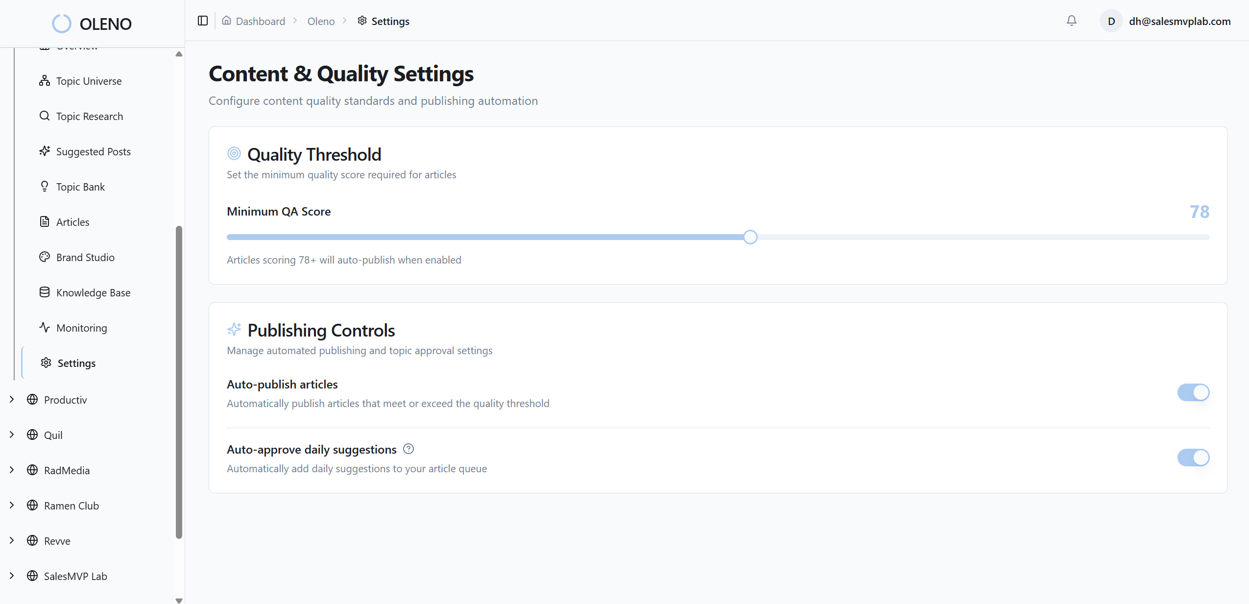
Rule 7: Automate Alt Text, SEO Filenames, And Visual QA Checks
Generate descriptive, non‑stuffed alt text from section context. Use canonical filenames with slugs and descriptors. Gate every image with accessibility and composition checks. If an image fails the gate, block publishing until it’s fixed. You don’t negotiate with gates.
Automation doesn’t erase accountability. It enforces it. When the system checks alt text, filenames, contrast, and placement, your baseline quality jumps without more meetings or Slack threads.
How Oleno’s Visual Studio Operationalizes These Rules
Oleno bakes these rules into a repeatable pipeline. Visual Studio applies your brand constraints, including why ai writing didn't fix, generates images, matches screenshots to relevant sections, and runs visual QA before anything publishes. You get speed without drift, because rules, not opinions, drive output.
Brand Asset Library And Rule Enforcement
Oleno ingests your palettes, logos, style references, and tagged screenshots, then applies usage constraints automatically. Color and logo rules aren’t “guidance”. They’re enforced. Templates lock structural layers, exposing only safe variables. This reduces back-and-forth and prevents off‑brand choices without tapping a designer for every article.
Under the hood, Oleno treats visuals as first‑class outputs. The system generates one hero and two to three inline visuals per article using your templates. Structural layers are respected by design. Screenshots are pulled from your library, not mystery folders. Visual guardrails move decisions upstream so your team doesn’t fight fires downstream.
Template-Led Generation, Semantic Matching, And QA Gating
Visual Studio creates a hero plus inline images using Google Gemini 3 Pro under your brand constraints. Product screenshots are matched to relevant sections via semantic similarity, with solution sections prioritized for context. Deterministic placement rules ensure images appear where they add meaning, not noise.

Every image passes automated checks: descriptive alt text and SEO‑friendly filenames generated from section content, contrast and composition validated, and placement consistency enforced. If something fails, Oleno runs refinement loops before publishing. No manual policing. No “we’ll fix it later” debt. When you’re ready to see it applied to your stack, Try Oleno For Free.
Conclusion
Here’s the point. You don’t need more design cycles. You need rules a system can enforce. When color, logo, composition, placement, ratios, and alt text are deterministic, your visuals stop causing friction and start compounding trust. Writers write. Images make sense. And publishing stops breaking at the finish line.
About Daniel Hebert
I'm the founder of Oleno, SalesMVP Lab, and yourLumira. Been working in B2B SaaS in both sales and marketing leadership for 13+ years. I specialize in building revenue engines from the ground up. Over the years, I've codified writing frameworks, which are now powering Oleno.
Frequently Asked Questions