Brand-Consistent Visuals: Generate & Place Images That Build Trust

Most teams don’t lose trust because their product is weak. They lose trust because their content looks like a collage of stock photos and last‑minute screenshots. I’ve done that scramble. We shipped posts that read like us and looked like someone else. Readers notice. They won’t always tell you. But they do notice.
Back when I ran Steamfeed, we won on volume and depth. When I led marketing at smaller teams, we won on speed and voice. The constant failure point? Visuals bolted on at the end. The copy said “authority.” The images said “template.” If you’ve ever debated a hero image at 3pm, you know the tax I’m talking about.
Key Takeaways:
- Treat visuals as part of the message, not decoration, and define rules upfront
- Centralize brand tokens and screenshot tags so placement can be deterministic
- Use semantic matching to put the right product visual in the right section
- Standardize aspect ratios and limits to prevent clutter and rework
- Generate alt text and filenames from section intent to support search
- Add a QA gate so off-brand visuals can’t slip through at publish
Want to see what this looks like without extra meetings? Try a system that does it for you. Try Oleno for Free.
Why Bolting Visuals On At The End Breaks Trust
Bolting visuals on at the end breaks trust because it signals “we didn’t plan this.” Readers recognize off-brand colors, generic stock, and mismatched screenshots quickly. Over time, those small misses create doubt. A post on pricing with a vague cityscape? That’s a tell.

The hidden cost of generic images
Generic images don’t just look bland. They dilute meaning. When a reader scans a section and the visual doesn’t reinforce the point, they have to work harder to understand what matters. That friction adds up across pages and sessions. It also quietly erodes recall of your brand’s look and feel.
I’ve watched teams publish thoughtful explainers and then drop in a handshake photo. It’s a credibility leak. Visuals influence perceived coherence, which influences trust. There’s research on this—visual consistency improves comprehension and brand recognition, even in small doses. If you need a primer, this breakdown of visual consistency meaning is a helpful baseline. The fix isn’t “nicer images.” It’s rules that tie visuals to message.
What does brand consistency actually mean in content visuals?
Brand consistency in visuals means decisions you can measure, not vibes you can debate. Colors and marks live in one library. Style references codify how “we” look. Templates handle hero and inline work. Product screenshots are tagged by feature and mapped to sections on purpose, not by gut feel in the CMS.
The metadata matters. Alt text and filenames shouldn’t be afterthoughts. They should reflect the intent of the section they support. That’s how search engines catch meaning without guessing. When this is built into your pipeline, you stop relying on taste and start relying on rules. It’s more boring than creative flair. It also works.
When is a hero image doing more harm than good?
A hero image hurts when it confuses the narrative or says nothing. A conceptual piece with a product-heavy hero can prime the reader to expect a demo. A product-heavy piece with abstract art can feel evasive. If a visual doesn’t advance the point of the section, skip it. Silence is better than noise.
Make the rule explicit. If the post is solution-heavy, lead with product benefit or a product-forward visual. If it’s conceptual, use abstract brand patterns, but still make them yours. Set ratios and thresholds—how big, how many, where. When that’s defined, no one has to argue about it in your publishing window.
The Real Root Cause Of Inconsistent Visuals
Inconsistent visuals come from fragmented tools and taste-driven decisions. Designers sit in Figma. Writers live in docs. Publishing happens in the CMS. The “rules” get interpreted three times. By then, consistency is a coin flip. The problem isn’t intent. It’s the handoffs.

Why fragmented tools make consistency impossible
When assets live in one place, style rules in another, and the brief in a third, you’re betting on human memory. People are smart. The process is brittle. The more stakeholders who touch a post, the more likely the visuals will drift from your brand. Not maliciously—just slowly.
You solve this by centralizing the Brand Asset Library and wiring it into the writing pipeline. The pipeline needs direct access, not a link to a doc. Writers shouldn’t paste hex codes. Systems should. Deterministic placement rules beat “can you swap that?” comments, especially when you’re shipping multiple posts a week. If you want a cross-channel view on the stakes, this perspective on building brand consistency across channels holds up.
What traditional design handoffs miss
Style guides teach principles, not runtime decisions. They rarely say, “Place a 16:9 hero, then a 4:3 inline after the direct answer.” They don’t tell you which product screenshot belongs under which H3. They can’t, because those are contextual calls made at publish time. That gap is where taste creeps back in.
Translate principles into rules. Map section types to template behavior. Define aspect ratios per slot. Define filename patterns. Create a shortlist of screenshot categories that can appear in each section type. When you do that once, you don’t have to re-litigate it in comments. The guide still matters. It’s just not the system.
How do brand tokens become repeatable rules?
Start with tokens—colors, marks, typography cues, style references. Then bind them to behavior. Example: conceptual posts use primary color accents with abstract patterns; solution sections prefer product visuals with highlighting on key UI elements. Make each rule testable so a system can validate it without guessing.
Attach ratios to templates. Hero at 16:9. Inline visuals at 4:3 or 1:1. No back-to-back images. Max three images per post unless it’s a tutorial. Map token sets to use cases and section types. That’s what makes “consistency” measurable. It’s not aesthetics. It’s rules in code.
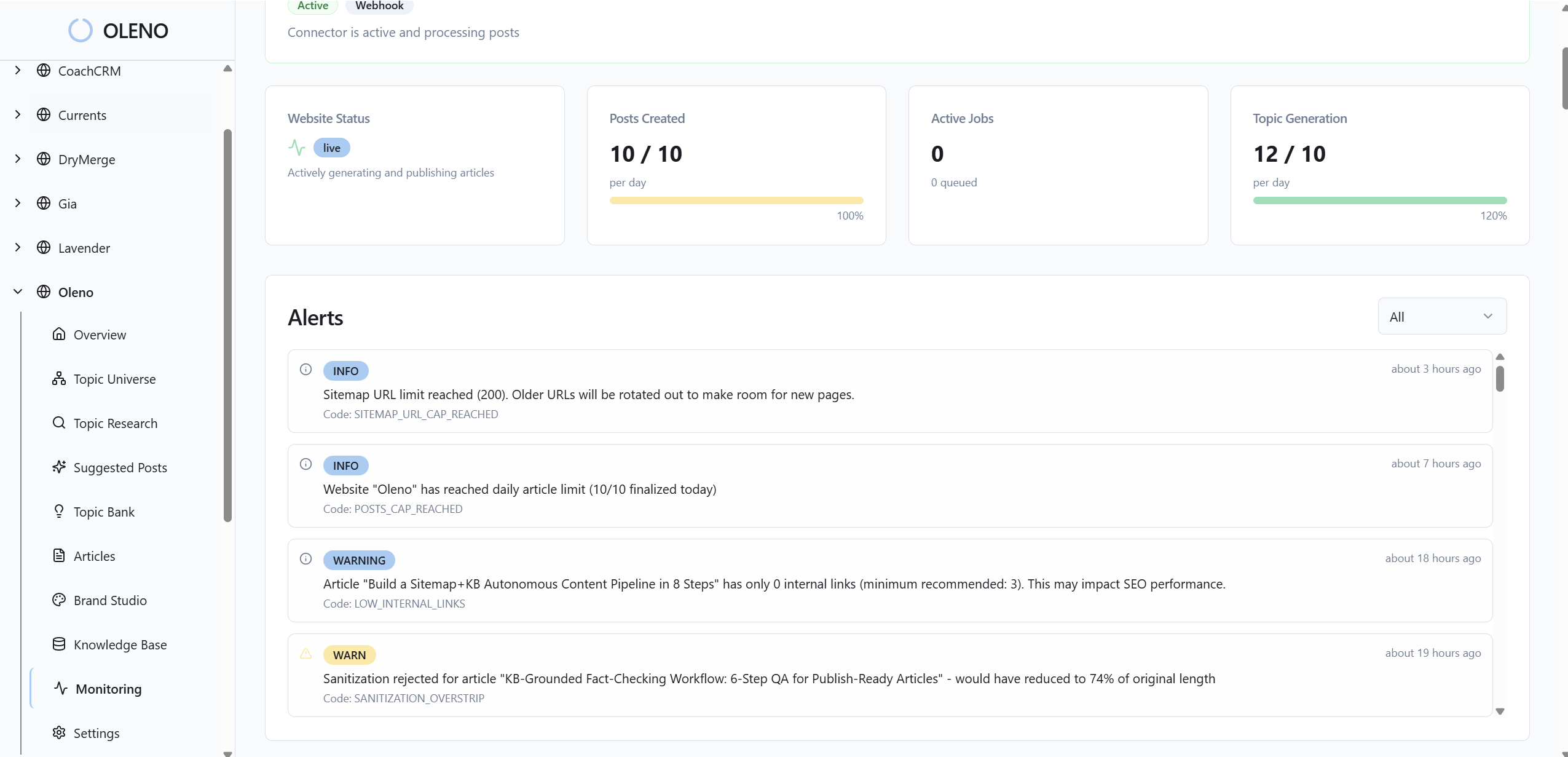
The Operational Drag You Can Measure
Inconsistent visuals create measurable drag: lost hours, avoidable rework, and weak SEO signals. The costs aren’t dramatic in isolation. They stack. When your team ships weekly, those small leaks turn into real time and real missed opportunities by quarter’s end.
Rework, delays, and missed SEO from ad hoc images
Let’s pretend you publish 50 articles per quarter. If each needs 30 minutes of image hunting and naming, that’s 25 hours of context switching before you’ve even reviewed. Add one round of rework per post when someone flags an off-brand visual. Another 15–20 hours, easy. And that’s a conservative pass.
Now look at metadata. If alt text and filenames are guesses, you’re throwing away structured signals that help search engines parse intent. A clean filename pattern and descriptive, section-aligned alt text are low-lift wins—when they’re built in. When they’re manual, they’re often skipped. Not because people don’t care. Because the clock is ticking.
What is the opportunity cost of misaligned screenshots?
Screenshots are proof. Put the wrong one under the right section and you’ve wasted a trust moment. If even 20 percent of posts miss that alignment, your high-intent readers are scanning the exact wrong image at the exact right time. That increases confusion and quietly reduces conversion on pages that should perform.
Semantic matching—text to tagged screenshot—closes that gap. It’s not fancy. It’s sensible. It ensures the “how” shows up where the “what” is being explained. There’s broader evidence that visual consistency builds trust and loyalty over time. This overview is a useful reference: Why brand consistency builds trust and loyalty.
The compounding effect across hundreds of articles
Consistency is a flywheel. Each post that ships with the same visual logic trains your audience to recognize you in seconds. Search engines get cleaner signals from filenames and alt text. Editors stop policing basics and focus on substance. The net effect isn’t one big win. It’s friction removed across the board.
Over six months, that feels like momentum. Over a year, it looks like authority. There’s also emerging research linking consistent, high-quality visuals to better processing fluency and brand outcomes. If you want to dig into the academic angle, here’s a representative thread from peer-reviewed work: journal research on visual presentation and trust cues.
Still firefighting this every week? You don’t have to. Run the rules once and let a system enforce them. Try Generating 3 Free Test Articles Now.
The Frustration Content Teams Feel Every Week
This isn’t theoretical. The pain is operational and emotional. You’re done writing. The CMS is prepped. Someone asks, “Do we have a better hero?” That question sounds small. It’s not. It triggers a scramble that derails focus right before publish.
The 3pm scramble before publish
You know the drill. Tabs open to stock sites. DMs to designers. Debates about whether the abstract image is “too cold.” Meanwhile, the copy is waiting. The launch calendar is waiting. I’ve lived that at small teams—LevelJump included—where the marketer is also the project manager and sometimes the salesperson. The scramble burns real time.
Replace the scramble with rules. Templates and a usable library kill 90 percent of these conversations. Not because the visuals are “perfect,” but because they’re correct and consistent. You still review. You don’t invent. That alone saves the end-of-day headache and reduces the chance you ship something off-brand because the deadline won.
Who owns the last-mile visual decision?
When ownership is unclear, everything becomes a debate. The right answer is simple: the system owns first pass, a reviewer owns the exception. Generate, place, and name assets based on section intent. Enforce rules automatically. If something fails a rule, fix it before a human ever sees it. Humans judge edge cases, not every pixel.
That shift also changes the tone of feedback. You’re no longer asking, “Do you like this?” You’re asking, “Does this follow the rule?” Much easier to answer. Much easier to scale. And much less likely to stall your publish.
A Production-Ready Visual System For Every Article
A production-ready visual system embeds rules into the pipeline: inventory what’s valid, tag it, standardize templates, and validate automatically. You don’t need new meetings. You need clearer decisions encoded into how content ships. Start small. Make it repeatable.
Audit your visual inventory and define brand tokens
Begin with an audit. Gather your logos, color palettes, style references, and product screenshots into one place. Clean duplicates. Tag screenshots by feature, use case, and funnel stage. Don’t overcomplicate the taxonomy. You’ll revise it later. The priority is a single source of truth that writing and publishing can actually use.
Then write token definitions in plain English. Which colors emphasize education versus product marketing? Where do logos appear and at what size? Which styles are allowed for conceptual pieces? Document the behaviors, not just the assets. If the rule can’t be read by a non-designer, it won’t be enforced by a system or a busy editor.
Template-driven generation for hero, inline, and social
Codify templates. Choose aspect ratios and counts you’ll support—hero at 16:9, inline at 4:3 or 1:1, social at 1:1 and 9:16. Tie each template to section types. For example, no hero on short announcements; first inline appears after the section’s direct answer; maximum three images per article unless it’s a tutorial.
Prompts for generation should reference brand tokens and style guides automatically. Editors shouldn’t be pasting hex codes. The system should apply them by default. This does two things: it reduces avoidable clutter and it keeps decision energy on content, not layout tinkering.
Visual QA checklist and automated validation before publish
Create a short, high-signal checklist that a machine can enforce: aspect ratios, color usage, logo sizing, spacing rules, alt text length, filename conventions, and image-to-word ceilings. Block publish if rules fail. It’ll feel strict the first week. It will feel like relief once your “surprise” edits disappear.
Keep the report readable so editors can fix issues without a detective hunt. The point isn’t policing. It’s consistency without meetings. Over time, the checklist becomes muscle memory for the system and a sanity check for the humans.
For a broader foundation on why this matters beyond a single post, here’s a useful explainer on visual consistency meaning. Different context, same takeaway: consistency is a decision system, not a mood.
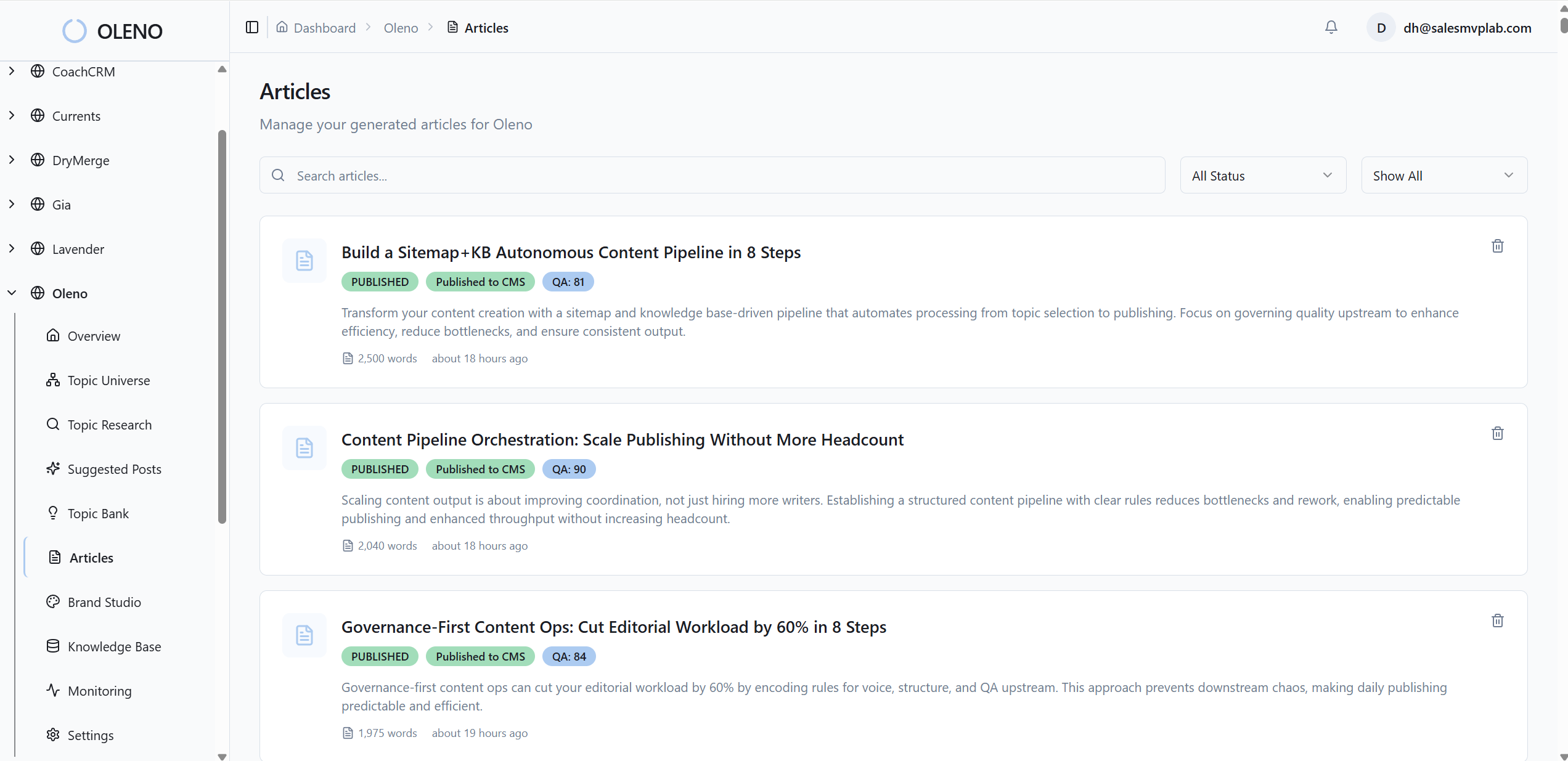
How Oleno Operationalizes Brand-Consistent Visuals At Scale
Oleno operationalizes this new way by turning brand inputs into publish-ready visuals—without manual handoffs. Your colors, marks, style references, and tagged screenshots feed a pipeline that generates, places, and validates images with deterministic rules. You keep control. The busywork disappears.
Oleno’s Visual Studio generates brand-consistent hero and inline images using your Brand Asset Library. It applies your color palette, logos, and style references automatically, then outputs the right aspect ratios for each slot. No stock hunting. No last-minute resizing. And when the post is solution-heavy, product visuals are prioritized on purpose.
Screenshots are matched to sections using semantic similarity, so the “proof” shows up where the claim is made. Oleno enforces concrete placement rules—how many images per article, where they appear, and how they’re spaced—so you don’t end up with clutter or back-to-back visuals. Alt text and filenames come from section intent, not a guess five minutes before publish.
Quality isn’t a hope. Every article passes Oleno’s QA gate that checks structure, brand alignment, snippet readiness, visual placement, alt text, and filenames. If something fails, Oleno loops and fixes it before it ever hits your CMS. You feel the impact where it counts: fewer 3pm scrambles, fewer off-brand posts, and hours back each quarter that used to vanish into rework.
Want to move from theory to practice without adding headcount? Try Using an Autonomous Content Engine for Always-On Publishing.
Semantic screenshot matching places product visuals where they convert
When the system reads a section about, say, “semantic matching,” it doesn’t grab any screenshot of your dashboard. Oleno looks at tags and section text, then selects the closest match so the image clarifies the claim right there. That reduces reader confusion and saves your editor from playing librarian.

Over time, this consistency compounds. Readers see the right product proof in the right place, every time. Editors stop second-guessing the library. And your team gets back the hours that used to melt in the handoff between writing and design. It’s not flashy. It’s dependable—which is what ships.
Conclusion
Here’s the thread: visuals aren’t garnish. They’re part of the message. When you treat them like a system—tokens, templates, semantic matching, and a QA gate—you stop leaking credibility at publish time. Whether you run a lean team or a big one, the outcome is the same: fewer debates, fewer delays, and content that looks like it came from you. Consistently.
About Daniel Hebert
I'm the founder of Oleno, SalesMVP Lab, and yourLumira. Been working in B2B SaaS in both sales and marketing leadership for 13+ years. I specialize in building revenue engines from the ground up. Over the years, I've codified writing frameworks, which are now powering Oleno.
Frequently Asked Questions