How to Use Visual Studio Workflows to Make Scaled Content Look On-Brand

You can publish fast and still lose trust. It only takes one off-brand image to make your product feel generic. I’ve watched great content fall flat because the visuals told a different story than the words. Not wrong. Just off. And at scale, “off” compounds.
Here’s the shift. You don’t fix this with more art direction tickets. You fix it with a system: a brand asset library, placement rules, screenshot tagging, and automated filenames/alt text. Do that, and visuals stop being a fire drill and start reinforcing your product—everywhere, every time.
Key Takeaways:
- Treat visual consistency like code: one source of truth, governed outputs
- Tag screenshots with feature-level metadata so placement can be automated
- Prioritize solution sections for product visuals; keep abstract for narrative
- Automate alt text and filenames; they compound for SEO and accessibility
- Set aspect ratio defaults (16:9 hero, 4:3 or 1:1 inline) and stick to them
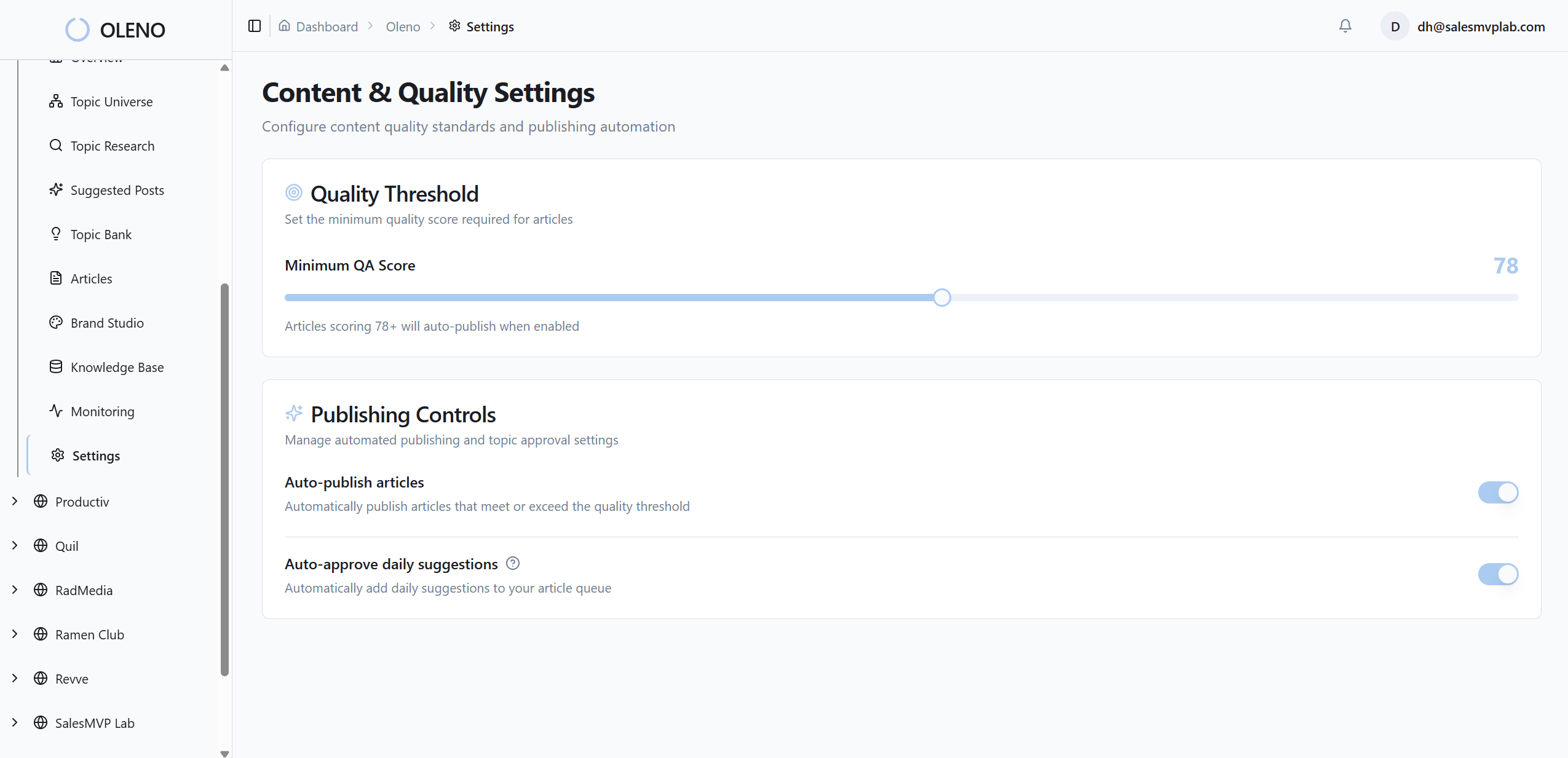
- Use QA to block off-brand assets at publish, not after they’re live
Generic Visuals Erode Product Credibility Fast
Generic visuals erode credibility because they signal “we don’t know our product.” Consistency in color, logo use, and product-first imagery builds recognition and trust over time. For example, a solution section that pairs the right screenshot with a clear headline tells a coherent story and keeps readers engaged longer.

Why Visuals Fail At Scale
The more you publish, the louder every mismatch gets. One stock photo turns into fifty. A camera-roll filename sneaks through, and now your CMS is littered with “IMG_4837.png.” It’s not malice; it’s drift. People do what’s fast in the moment. Systems prevent that. Rules make “right” the default. That’s the job.
When teams bolt visuals on at the end, nuance disappears. Product context gets replaced by generic art. Readers feel the disconnect, including how to create abstract on, even if they can’t explain it. I’ve sat in those reviews—good content, wrong visual vibe—where everyone nods and ships anyway. That’s how credibility leaks. Quietly at first. Then obviously.
What Is Visual Consistency And Why Does It Matter?
Visual consistency is predictable use of color, logo, typography, and product-first imagery—applied the same way, everywhere. It reduces cognitive load and speeds recognition. It also helps machines: search engines read filenames and alt text, which compounds discoverability. If you want trust at scale, consistency isn’t decoration; it’s infrastructure.
You can debate style forever. Or you can define constraints and move. If your rules say “solution sections get product screenshots,” your team stops arguing about whether to use a mock or a metaphor. Set defaults. Make exceptions expensive. That’s how you keep velocity without losing brand. For a clear lay of the land, see this definition of visual consistency from Siteimprove and a pragmatic overview of how to create a style guide.
Treat Visual Consistency As A System
Treating visual consistency as a system means centralizing assets, tagging screenshots, and codifying placement rules that run every time. A governed library prevents drift, and semantic matching removes guesswork. For example, a “Billing → Usage Limits” screenshot should find the “Solution” section about limits without anyone browsing folders.

What Should Live In Your Brand Asset Library?
Everything you need, nothing you don’t. Colors, logos, lockups, and style reference images. A catalog of product screenshots tagged with feature keywords and product areas. Include aspect ratio preferences for hero and inline placements. Add filename and alt text patterns. The goal isn’t flexibility; it’s predictability. You want to remove choices that don’t matter.
We learned this the hard way. Without a governed library, every article turns into a small design sprint. People forage through past decks. Someone crops a screenshot in a way design would never approve. A month later, you’ve got five versions of the same logo floating around. The fix is a single, enforced source of truth. Consider how operational brand kits work at scale in tooling like Microsoft’s official brand kits guidance. Different tool, same principle: one kit, governed outputs.
Tagging Screenshots For Semantic Placement
A screenshot without tags is a needle in a haystack. Tag each image with product area, feature name, use case, and supported section types (solution, how-to, comparison). Add a short description in plain language. The test is simple: could another teammate find the right asset in 10 seconds? If not, your tags are too clever.
Semantic placement isn’t fancy; it’s just structured context. When a section’s copy references “usage alerts,” the workflow should immediately propose the “Alerts & Notifications → Usage Alerts” screenshot. No guessing. No browsing shared drives. Less room for error under deadline. That’s how accuracy scales—by design, including the rise of dual-discovery surfaces:, not effort.
Rules That Govern Placement And Precedence
Decide once. Document it. Hero images use abstract, on-brand visuals or high-level product context. Solution sections get first priority for product screenshots. Limit each article to two or three inline visuals to keep performance crisp. Default to 16:9 for hero, 4:3 or 1:1 inline. When rules conflict, prioritize clarity, then brand, then variety.
The specificity matters. “Use a product screenshot where readers make a decision” beats “use more screenshots.” Rules can be simple. But they can’t be vague. And when you make an exception, write it down and decide if it becomes a rule. That’s how your system learns without becoming a spreadsheet hobby.
Want to see how governed workflows beat ad-hoc art direction? If you’re exploring this shift, you can Try Generating 3 Free Test Articles Now to feel how rules create consistency.
The Costs You Do Not See In Manual Image Work
Manual image work taxes teams with hidden rework, approvals, and context switching. Time slips in small increments that add up monthly. You also pay an SEO and accessibility tax when filenames and alt text go missing. For example, twenty posts with 45 minutes of image handling each is two lost workdays.
Time Lost To One-Off Image Edits
Let’s pretend you’re shipping 20 posts a month. If you’re spending 45 minutes per post hunting images, cropping, renaming, adding alt text, and pasting into the CMS, that’s 15 hours. Add three approval pings and a “quick fix” after publish, and you’re near two full days. It’s a quiet tax that sneaks under the radar.
What’s worse is the switching cost. Your writer becomes a part-time designer. Your designer becomes a librarian. Nobody’s doing their best work, and the final output still looks inconsistent. That’s the frustration—lots of motion, little compounding value. This is where automation isn’t nice-to-have; it’s the only way to keep pace without burnout.
The SEO Tax From Missing Alt Text And Filenames
Alt text and filenames are tiny signals that compound. Skip them at scale, and you miss discoverability and accessibility standards. The fix is structural: codify filename patterns (topic-feature-descriptor.png) and generate alt text from section intent and screenshot tags. Don’t ask people to remember; make it automatic so it doesn’t slip at volume.
I’ve reviewed libraries full of “Screen Shot 2024-05-12 at 10.44 AM.png.” You can’t govern that after the fact. You set the pattern, including the shift toward orchestration, and you make non-conforming files a blocker. It’s not punitive; it’s guardrails. Standardization frees your team to focus on substance.
When Off-Brand Images Hurt The Sales Cycle
I’ve seen this in the wild. Strong article. Wrong visual. The customer lands, sees a generic mock that doesn’t resemble the product UI, and credibility wobbles. They skim faster. Ask fewer questions. Now your next touch has to do extra work. It’s not dramatic—just a constant leak.
Approvals don’t save you if the system allows drift. If approvals are a way of life for you, ensure the workflow is structured and predictable (see Microsoft’s overview of approval workflows). Better yet, automate the parts that shouldn’t require human judgment in the first place.
The Moments That Hurt, And How To Avoid Them
The painful moments are predictable: outdated logos in critical places, late-night hot fixes that ripple inconsistencies, and unclear criteria for when to involve design. Address them upstream with a governed asset library, QA gates, and explicit escalation rules. One fix should prevent the next fifty problems.
When Your Launch Goes Live With The Wrong Logo
It happens. New brand guidelines. Old lockup on the hero. Nobody meant to ship it; it just slipped. The fix isn’t “try harder.” Put all logos and marks behind one source of truth. Enforce filename patterns that include versioning. If your CMS can’t block non-current assets, your QA gate should flag them and halt publish.
This sounds rigid. It’s not. It’s merciful. People make mistakes under deadline pressure. Systems catch what humans miss so your brand doesn’t pay for it. You’re not slowing down; you’re preventing avoidable rework.
The 3 AM Fix That Never Sticks
A teammate swaps an image in the CMS. Filenames break your convention, alt text is missing, and now five articles contradict each other. Don’t patch it downstream. Convert that one-off fix into an upstream rule. Ask, “What should’ve prevented this?” Bake the answer into your pipeline so the next 50 articles inherit the solution.
This is the quiet discipline that compounds. Each incident either becomes a precedent or a policy. Choose policy. You’ll sleep better.
When Should You Pull In A Designer?
Eighty percent of visuals are repeatable and should be automated. The remaining 20 percent—net-new concepts, including why ai writing didn't fix, complex data visuals, or homepage-level storytelling—deserve design time. Keep criteria explicit: if the image clarifies a complex claim or has a long shelf life, escalate. If not, let the system handle it.
This isn’t about sidelining design. It’s about protecting their focus. Designers shouldn’t crop screenshots; they should craft the moments that actually move the brand forward.
A Practical Workflow You Can Run In Visual Studio
A practical workflow starts with a governed brand asset library, then uses semantic matching to place the right screenshot in the right section. Automate alt text, filenames, and aspect ratios. For example, 16:9 heroes, 4:3 inline, two to three visuals per article, and solution sections prioritized for product imagery.
Build The Brand Asset Library Once, Then Enforce It
Collect your brand colors, approved logos, lockups, style references, and a big library of product screenshots. Add feature and use-case tags. Define aspect ratios per placement type. Standardize filename and alt text patterns. Then lock it in. The library becomes the only input the system can use—no freelancing, no folder spelunking.
Enforcement is where most teams wobble. A library without rules is a suggestion. Set rules for what can be generated, what can be placed, and how assets are named. Every exception should be a conscious decision with a written precedent—not a habit that creeps in at scale.
Programmatic Screenshot Matching And Placement
Map section intent to screenshot tags. If a “Usage Alerts” section mentions thresholds, the workflow proposes that exact screenshot. Solution sections get first dibs on product visuals. Narrative or strategy sections can use abstract, on-brand imagery to reinforce tone without distracting. Limit inline visuals to keep performance sharp.
You don’t need exotic AI here; you need consistent signals. Semantic matching removes browsing and guesswork. It also shortens approvals because there’s less to argue about. The right image tends to be obvious when the tags are clear.
Alt Text, Filenames, And Ratios That Scale
Generate alt text from section intent and screenshot metadata. Produce SEO-friendly filenames that blend topic, feature, and a short descriptor. Default to 16:9 for hero, 4:3 or 1:1 for inline, and keep a 9:16 variant on hand for repurposing. These are small choices that pay off at scale when they’re automatic.
Teams get nervous about automation here. Reasonable. So start with human-in-the-loop review for a week. Once the patterns are right, remove the review. You want energy going to narrative and product clarity, not renaming files.
Curious how this looks when the whole pipeline runs together? You can Try Using An Autonomous Content Engine For Always-On Publishing and see how rules translate to output.
How Oleno Visual Studio Automates Brand-Consistent Visuals
Oleno’s Visual Studio automates brand-consistent visuals by referencing a central Brand Asset Library, matching screenshots to sections using semantic similarity, and enforcing filenames/alt text and placement rules through QA. Solution sections are prioritized for product imagery. For example, hero images follow brand style, and inline visuals are limited and correctly sized.
Brand Asset Library With Governed Outputs
Oleno’s Visual Studio pulls from a governed Brand Asset Library: palettes, logos, style references, and tagged product screenshots. Generation runs through those constraints, not around them. The result isn’t “more images,” it’s consistent outputs that look like you on the first pass, not the third.
Because the library is the source of truth, drift has nowhere to hide. You aren’t asking people to remember subtle guidelines; you’re ensuring the system can’t step outside them. That’s a calmer way to scale brand execution.
Semantic Screenshot-To-Section Matching
Screenshots are matched to relevant sections using semantic similarity. Solution sections get first priority for product visuals so readers see the product where decisions happen. Narrative sections get abstract, including why content now requires autonomous, on-brand imagery that supports the message without muddying it.

In practice, this means fewer mismatches and fewer edits. Teams stop arguing about which screenshot to use because the right choice is proposed automatically. Faster reviews. Clearer stories.
Automated Alt Text, Filenames, And Solution-First Placement
Alt text and SEO-friendly filenames are generated automatically from section intent and screenshot tags. Placement rules limit inline visuals, enforce aspect ratios, and bias toward product imagery in solution areas. Accessibility and discoverability improve as a side effect of doing things correctly, not extra effort.

You’re not building heroics into every article; you’re building habits into the system. That’s the difference between velocity with ai content writing and churn.
QA Checks And Publishing Without Handoffs
Oleno runs automated QA on visuals, filenames, alt text, and placement rules. If something misses the threshold, the pipeline refines and re-tests before publish. When it passes, assets ship through mapped CMS fields—no copy-paste, no last-minute scramble, no “who has the latest logo?” messages.

If you want to validate this in your own stack, start small. Ship a few pieces and compare time-to-publish and rework. Then scale up. When you’re ready, Try Oleno For Free and see the full pipeline—topic to publish—run on its own.
For teams who track platform changes closely, it’s useful to keep an eye on evolving guidance in dev ecosystems, like the Visual Studio 2022 release notes. Different domain, same lesson: constraints and tooling updates shape better defaults.
Conclusion
Here’s the throughline: visuals aren’t a garnish. They’re part of the narrative. If they’re off, the whole story tilts. Treat them like a system—one library, clear tags, strict placement rules, automated alt text and filenames, and QA that blocks drift. Do that, and your product looks like itself at scale. Every time.
About Daniel Hebert
I'm the founder of Oleno, SalesMVP Lab, and yourLumira. Been working in B2B SaaS in both sales and marketing leadership for 13+ years. I specialize in building revenue engines from the ground up. Over the years, I've codified writing frameworks, which are now powering Oleno.
Frequently Asked Questions