Place Product Screenshots That Convert: Semantic Matching Playbook

You can do everything else right and still lose the click because the screenshot is in the wrong place or shows the wrong thing. The copy says “Connect Slack” and the image shows a generic dashboard. That disconnect creates doubt. It’s small, including the rise of dual-discovery surfaces:, but it stacks. Fixing it is less about design flair and more about matching meaning.
I learned this the hard way. At PostBeyond, I could write fast and ship a lot. But when the visuals didn’t reinforce the claim next to the CTA, sales felt it immediately. Fewer demo requests from pages that looked great. The issue wasn’t the writing. It was random visuals and inconsistent placement. If you want a system, not a scramble, treat visuals like structured proof inside your process. That is where autonomous content operations actually help.
Key Takeaways:
- Treat screenshots as structured assets that prove specific claims, not decoration
- Use semantic matching to pair section meaning with the right visual, then apply placement rules
- Index screenshots once with tags, captions, and embeddings, so you can reuse them everywhere
- Adopt simple annotation and cropping standards that reduce doubt near CTAs
- Place the first proof visual within 80–120 words of the solution claim to support action
- Automate alt text and filenames in a consistent pattern for accessibility and SEO
- Make decisions deterministic, cache them, and only A/B test when the hypothesis is clear
Misplaced visuals erode trust and conversions
Misplaced visuals cause friction because the brain expects alignment between a claim and what it sees. When the image is generic, outdated, or miles from the CTA, readers hesitate. A simple example, a “Start free trial” button under a billing screenshot that shows a different UI state.

Step 1: Audit current articles for visual–claim mismatch
Start with your top 15–20 pages. Flag every place the nearby screenshot does not reinforce the claim or CTA. Capture URL, including why ai writing didn't fix, H2, claim text, image filename, and distance to CTA in a simple sheet so you can quantify the gap. Score each instance for fit and clarity. Patterns show up fast.
I like to fix three pages end to end first. Treat them as your pilot, your baseline for future swaps and tests. If you want outside inspiration on how visuals influence buying context, read how app teams localize and tune their frames in SplitMetrics’ approach to targeted screenshots.
What is semantic matching and why does it matter?
Semantic matching compares meaning, not just keywords. You embed a section’s text and compare it against embeddings built from each screenshot’s tags and caption. The closest meaning wins. This avoids pretty-but-wrong visuals and increases congruence near your CTA, which usually means fewer objections and smoother clicks.
Curious how fast you could test this on three pages? Start here: Request a demo now.
Screenshots become structured assets when you map intent
Screenshots become reliable proof when you map them to journey stages and section intent. You decide where you need to educate, where you need to prove, and where you need to guide. Then you route the right assets to the right moments so the story feels obvious.

Step 2: Map screenshots to buyer journey and solution sections
Pick the H2s that deserve visuals, for example “solution overview,” “how it works,” “benefits,” and “results.” Label each with an intent like prove, guide, or reassure. Build a crosswalk that connects H2 title to user intent, core claim, and eligible feature areas. Keep a must‑show list for pricing, integrations, and workflow steps.
This is where your narrative structure pays off. If the section’s promise is crisp, the visual’s job is simple. If you want a model, the sales narrative framework ties section intent to proof moments cleanly.
Step 3: Define placement intents per section
Educate visuals go early in the section and orient the reader. Prove visuals sit close to quantified claims or social proof. Guide visuals pair with micro-CTAs and short how‑to bullets. For each intent, set a placement window, for example prove visuals within 40–80 words of the claim. Add mobile exceptions.
Who should own the visual map?
Content ops should own the map with input from product marketing and design. Editors define intents and where proof belongs. PMMs verify claim‑feature alignment. Designers advise on clarity and color choices. Bake this into your brief template so writers expect intentional placement, not a last‑minute drop at the bottom of the page. Revisit quarterly as product surfaces change. Outdated UI undermines credibility.
If you need a reminder that orientation and framing choices are not cosmetic, see Gummicube’s guidance on landscape vs. portrait trade‑offs. Different orientations change scan patterns and emphasis.
Manual picking doesn’t scale—index them once, reuse everywhere
Manual screenshot picking burns cycles because every page becomes a bespoke hunt. Indexing turns screenshots into reusable building blocks. You tag them once, describe the claim they support, embed them, and reuse them by meaning across your library.

Step 4: Build the screenshot index: tags and metadata
Create a record per asset. Include feature, including why content now requires autonomous, subfeature, UI state, persona, journey stage, claims supported, capture date, version, aspect ratios, and sensitive flags. Write short structured captions that state the claim explicitly, for example “Connect Slack to trigger alerts in publishing settings,” not “settings page.” Add a field for CTA adjacency suitability.
Tie this to your content knowledge. The stronger your structured facts, the better your retrieval. This is the same reason knowledge bases accuracy matters for drafting, and why semantic expansion enrichment improves coverage.
Step 5: Create an embedding strategy for retrieval
Generate text embeddings for each asset from tags, the structured caption, on‑image text via OCR, and nearby docs. Store vectors with metadata in a vector database. Use hybrid search, semantic score plus filters like persona and product area. Re‑embed when captions or tags change so your index stays aligned with your UI.
If you want the deeper science, vision‑language models like CLIP illustrate how text and image semantics align in a shared space. A good overview is in OpenAI’s CLIP paper on arXiv.
What metadata actually moves the needle?
Short, explicit captions mapped to claims tend to lift match quality more than generic tags. Persona and journey stage filters reduce false positives when features sound similar. Let’s pretend you have 300 assets. Tightening captions and adding journey filters can cut mismatches by 30 to 40 percent in early pilots. The upside is fewer rewrites and less design rework near launch.
Clarity beats pretty—design standards that build confidence
Design standards reduce doubt because readers can spot the action instantly. A small label or arrow near the right toggle is enough. Over-designed frames look like ads and slow people down. Keep it simple and consistent so the eye lands on what matters.
Step 6: Annotation guidelines that reduce doubt
Use concise callouts, four to seven words per label, including the shift toward orchestration, one or two arrows at most. Highlight the action area, the toggle, dropdown, or save action, not the whole panel. Keep brand‑consistent colors with strong contrast and avoid red unless it signals risk. Add a “what this shows” caption below every image for screen readers and scanners.
Step 7: Cropping and aspect ratios for readability
Crop to the task, not the whole page. Remove browser chrome unless it adds context. Show one step per frame to avoid cognitive overload. Prepare primary ratios, 16:9 for desktop, 4:3 for in‑article, 1:1 for grids. Define safe areas so labels never get cut on mobile. For a sanity check on clarity constraints in commerce, skim Amazon’s main image guidance summary.
Deterministic matching and placement drive action
Deterministic matching and placement remove randomness. You match each section by meaning, then place the proof visual inside a defined window near the claim and CTA. Consistency builds trust. A good example is a “Connect Slack” frame within 100 words of the claim and just above the button.
Step 8: Semantic match each H2 to a screenshot using embeddings
Compute a vector for the H2 plus opening paragraph and search your screenshot index with relevant filters first, like persona and feature group. Select the top candidate above a confidence threshold, for example 0.78. If nothing qualifies, fall back to the nearest feature cluster. Cache decisions per URL and H2 hash for repeatability.
Step 9: Placement heuristics near solution sections and CTAs
Prioritize the first solution visual within 80 to 120 words of the core claim. Keep CTA proximity tight, image, one sentence, CTA. Avoid long paragraphs between them. Limit two visuals per H2 unless you are running a short walkthrough. On mobile, collapse side‑by‑sides into one column while preserving order and captions. See placement testing patterns in AppTweak’s product page A/B testing guide.
If you are formalizing your publishing flow, it helps to understand where images are injected and how field mapping works. Here is a primer on how images fit into a governed publishing pipeline.
Step 10: Alt text and filename patterns that help SEO and accessibility
Use an alt text pattern like action plus object plus context, for example “Connect Slack to trigger pipeline alerts in publishing settings.” Do not stuff keywords. Describe the task. For filenames, use product‑feature_action‑context_shortslug in kebab case. Example, product-alerts_connect-slack-publishing.png. Store alt text with the asset and generate at placement time, with manual overrides for sensitive pages. The dual discovery model explains why this structural clarity benefits both search and AI assistants.
Ready to turn placement into a repeatable system instead of a guessing game? Take the next step: try using an autonomous content engine for always-on publishing.
How Oleno automates visual matching, placement, and QA
Oleno automates selection, placement, and quality so visuals reinforce claims by default. It matches sections to screenshots by semantic similarity, places them using deterministic windows near solution claims, then generates alt text and filenames programmatically. The result is consistent, on‑brand proof where it matters.
Step 11: Selection code and CMS injection (sample pseudo‑code)
Make selection a deterministic step after draft approval. At a high level, including ai content writing, embed the H2 and its lead paragraph, query the vector store with filters, pick the top match above threshold, compute the slot window, then inject the image with generated alt text and a clean filename. Persist the decision so reruns are idempotent and rollback is simple.
- q = embed(h2 + lead); candidates = vector_db.search(q, filters)
- pick = top(candidates, threshold 0.78); slot = window(h2, 80–120 words)
- alt = generate_alt(pick.caption); filename = generate_name(pick)
- inject_image(url, slot, pick.path, alt, filename)
Map fields to your CMS connector and store the inputs and outputs for each placement event. This aligns with a pipeline approach where publishing is reliable, as covered in the publishing pipeline.
Step 12: Monitoring, A/B testing, and rollback rules
Track per‑section signals, for example scroll depth at image, CTR on the adjacent CTA, time‑to‑CTA, and form starts. Page‑level conversion alone hides useful detail. When you A/B test, predefine guardrails. If CTR drops more than 10 percent for seven days, roll back to the previous asset automatically. Log inputs, vectors, filters, and thresholds so every decision is explainable and repeatable. For test design sanity, see AppTweak’s A/B testing guide, and for cognition context, review visual attention findings in usability research. If you are shifting from prompts to pipelines, this is the mindset shift, covered in the shift to orchestration.
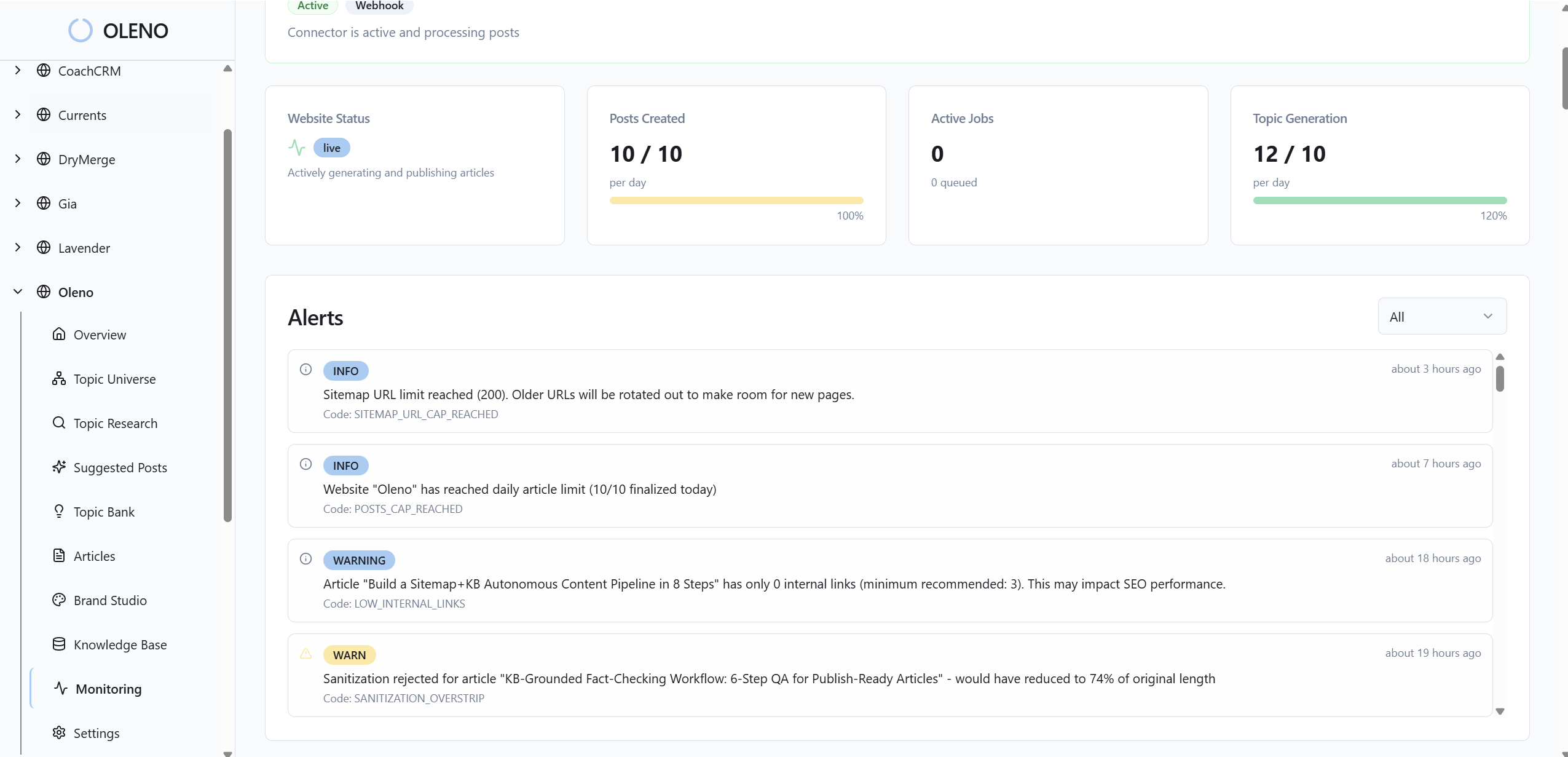
What metrics prove this is working?
Look for improved claim comprehension, lower bounce right after the solution section, higher CTA CTR within that section, and fewer support tickets linked from that page. Secondary signals matter too. Less editing time, fewer design requests, more consistent alt text quality in QA. Do not chase vanity lifts. Focus on clarity where action happens. For context on why bolted‑on visuals often fail, here is why why ai writing didn’t fix it.
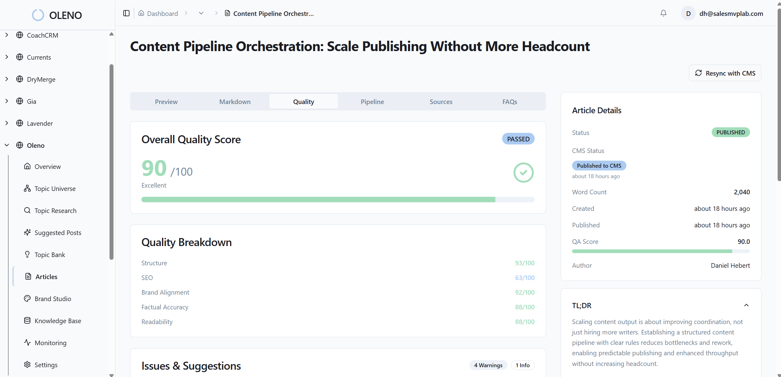
Remember that 15‑page audit you dreaded and the hours of manual picking per article? Oleno eliminates most of that by making image selection and placement part of a governed pipeline. Oleno’s Visual Studio references your brand asset library, then prioritizes product visuals where they support key claims. Oleno matches product screenshots to relevant sections using semantic similarity, so the “Connect Slack” claim gets the actual Slack connection frame. Oleno places images intentionally using placement windows, not randomness, which is why proof shows up near CTAs instead of being buried.
In practice, here is what changes. Oleno generates SEO‑friendly alt text and filenames automatically from your structured captions, which keeps accessibility on track without extra work. Oleno injects internal links and schema deterministically during publishing, so all the structural pieces ship together. And every draft passes through a quality gate that evaluates structure, brand alignment, snippet readiness, and visual placement rules before it publishes. You get consistent outcomes, not a design scramble at the end.
Tie this back to cost. When captions or tags change, Oleno re‑embeds assets and reuses them across your library. No more reshooting or re‑cropping the same feature for five different pages. Editors stay focused on narrative, while the system handles repetitive placement logic. If you want to experience the pipeline without retooling your stack today, Request a demo.
Conclusion
If you want screenshots that convert, stop treating them like decoration and start treating them like structured proof. The sequence is simple. Map intent, index assets with clear captions, match by meaning, then place on purpose near the claim and CTA. Do that and the page feels obvious. No second guessing, no visual whiplash.
You do not need a bigger design budget to get there. You need rules, an index, and a consistent way to make decisions. Whether you build the pipeline in‑house or let Oleno run it, the goal is the same, predictable clarity where action happens. The moment readers see the exact UI that matches the promise they just read, they click. That is the shift. From pretty to proven. From random to deterministic placement. From guesswork to a system you can trust.
About Daniel Hebert
I'm the founder of Oleno, SalesMVP Lab, and yourLumira. Been working in B2B SaaS in both sales and marketing leadership for 13+ years. I specialize in building revenue engines from the ground up. Over the years, I've codified writing frameworks, which are now powering Oleno.
Frequently Asked Questions