Product Microcopy that Sounds Like Your Brand: 7 Rules & Review Workflow

Most teams obsess over color, spacing, and pixel-aligned icons. But users decide whether they trust you on the words. The tiny ones. Labels, buttons, helper text, errors. If those sound off, trust drops fast—long before anyone notices your rounded corners. You can feel it when it’s wrong. You struggle to name it when it is.
I learned this the hard way across a few companies. At PostBeyond, I could write fast and on-brand because I held the whole story in my head. Then the team grew. The “Save” button sounded different in three flows. At LevelJump, we shipped text from transcripts. Fast, but it missed structure—and when that happens in product, microcopy drifts. That’s why this matters: UI words are operational, not ornamental.
Here’s the plan: we’ll make the case, quantify the downside, feel the pain, then give you seven rules and a simple review workflow you can actually ship with. Nothing academic. Just what teams use to stop the drift and move faster.
Key Takeaways:
- Treat microcopy as a product surface with rules, not opinions
- Define 2–4 “microcopy tokens” for brevity, clarity, personality, and CTA style
- Build a 10-pattern library and ship rewrite templates before sprints
- Encode product truth and legal constraints next to templates
- Use a 3-role review gate with pass/fail checklists in PRs
- Instrument a few signals and iterate monthly, not daily
- A rules-first system reduces rework, speeds approvals, and keeps trust intact
UI Words Decide Trust Faster Than Design Details
Microcopy drives trust because it’s the first thing users decode and the last thing they remember in high-stakes moments. Short phrases carry brand, clarity, and intent faster than layout tweaks. If a payment error reads vague while a delete dialog sounds playful, users hesitate. Hesitation kills flow.

What is product microcopy, really?
Microcopy is the text inside the product—labels, buttons, helper text, permissions, errors, empty states, onboarding hints. It’s tiny but consequential, because people rely on words to understand risk and next steps. Definitions vary, but the fundamentals hold across UX guidance from places like Nielsen Norman Group on microcopy and UX writing.
Microcopy doesn’t exist to be clever. It exists to make decisions easier and safer. That means fewer words, more intent, and context-aware tone. I like to ask one blunt question when reviewing: does the user know what to do next without thinking? If the answer is “maybe,” rewrite it.
Here’s the tension. Your brand voice might be warm and witty. Great. But microcopy must flex by context. A playful onboarding hint can work. A playful permission prompt often doesn’t. Align the tone to the moment, not a vibe guideline.
Why does voice break at the button level?
Voice breaks because ownership fragments. PMs write a button, engineers write an error, legal modifies a disclaimer. Everyone’s doing their job, but no one holds the thread at 12 words or fewer. And yes, a thousand “good enough” decisions drift a brand fast.
The fix isn’t more meetings. It’s a compact rule set you can apply in 30 seconds inside Jira or Figma. For example: approved CTA verbs, contraction policy, first/second person rules, and how to express uncertainty. When the rules are close to the work, people use them.
One more practical point. If you want consistent voice, remove ambiguity. “Use contractions” is clear. “Make it friendly” isn’t. Tokens beat adjectives. Keep the rules short and testable.
The consistency problem the design system cannot solve
Design systems ship tokens for color, spacing, elevation. Useful, but they can’t tell you whether a destructive action should be “Delete” or “Remove,” or if buttons cap at five words. Without microcopy tokens, teams fill gaps with personal judgment. That’s where drift begins.
The answer is a tiny pattern library for common components plus enforceable rules. Not a 40-page style guide. A one-pager with patterns for buttons, labels, helper text, empty states, and errors—quick examples, do/don’t, and variable slots. Keep it paste-ready.
This isn’t theoretical. It’s how small teams stay fast without sounding like three different companies. The alternative? Opinions in Slack and rework in PRs. You know how that goes.
Ready to skip the theory and see a rules-first system produce consistent drafts? Try a quick run to feel the difference: Try Generating 3 Free Test Articles Now.
The Root Causes Of Microcopy Drift You Can Actually Fix
Microcopy drifts because decisions happen in different tools, by different roles, under deadline. The cure is portable rules that follow the work and reduce ambiguity. Think checklists and tokens that slot into Jira and Figma, not long prose guides. Teams adopt what saves time.

Fragmentation across roles is the real culprit
Product, design, engineering, and legal all make micro decisions. Each team uses different tools and timelines. That fragmentation creates tiny tone shifts—a “Continue” here, a “Next” there—that compound into inconsistency. No one intends drift. The system allows it.
You don’t need a new committee. You need a shared rule set that travels with the ticket. A one-pager that PMs can attach, designers can reference, engineers can slot into code, and legal can bless. Checklists beat comments. Tokens beat subjective edits.
Here’s a simple move: put approved verbs and error structure in the ticket template. Now decisions aren’t reinvented per PR. It also lowers cognitive load—people decide once, then follow the play.
What do traditional style guides miss?
Most voice guides are long, literary, and built for brand campaigns. They’re useful for story. They’re unhelpful when you’re deciding whether a field label can be a fragment. The gap is operational. Teams need rules they can check in seconds.
Two to four tokens cover most of the job: brevity, clarity, personality, CTA style. Add a compact pattern library (5–10 components) with do/don’t examples and variable slots. That’s enough structure to cut rework, without freezing creativity. And yes, it fits on a page.
If you want more justification, the brand research angle is covered elsewhere—clarity and consistency correlate with trust in repeated studies and industry roundups like Sprinklr’s guide to brand voice. We’re keeping it practical here.
Where product truth and legal constraints go missing
Claims policies live in docs. Error messages live in code. That gap invites risk. Vague warnings creep in because no one has the allowed language at hand. Or worse, an error fails to mention data impact because the writer didn’t know the rule.
Fix it by encoding product truth and allowed claims as decision rules next to templates. For example: “If payment fails, include the system, the cause class, whether data changed, and the next safe action.” That’s testable. Legal can sign it once. Everyone ships faster.
You don’t need a policing culture. You need reusable decisions. When the rules sit beside the words, teams move with more confidence and fewer escalations.
The Measurable Cost Of Inconsistent Microcopy
Inconsistent microcopy has real costs: lost conversions, higher abandonment, slower releases. Even small tone mismatches nudge people to pause, re-read, or bail. Ad-hoc review adds rework and delays. The math doesn’t need to be perfect to be useful—directionally, it’s material.
Let’s pretend your checkout uses three CTA styles
Assume 50k monthly checkouts, baseline 60 percent completion. If mixed CTA verbs and tones drop micro trust by one point, you lose 500 conversions a month. At $50 average order value, that’s $25k monthly. You don’t need perfect words, just consistent patterns.
I’ve seen teams tighten this up in a week: standardize verbs, cut button text to five words, align labels to sentence case, and remove mixed tone hints. It’s not glamorous. It works. Consistency reduces effort at decision points, which speeds people through.
For a broader lens on friction in checkout flows, plenty of research points to clarity, predictability, and guidance as the dominant factors, such as Baymard Institute’s checkout usability research.
Error copy that scolds increases abandonment
Errors that blame the user or hide the fix drive exits. If 15 percent of users see an onboarding error and a harsh tone pushes 10 percent of them to quit, that cohort shrinks quickly. The rewrite is simple: state the cause, show the fix, offer a retry.
Structure helps. “We couldn’t verify your code. Enter a new one or resend.” It’s short, clear, and gives a next step. Add one line for time limits if needed. And remove blame. People don’t care why your system flaked. They care what to do.
A predictable pattern for errors also helps support. Fewer tickets. Faster resolution. You’ll still have incidents. You’ll have fewer preventable ones.
Review bottlenecks slow releases, which creates workarounds
When legal or brand review requires meetings, teams bypass it under deadline pressure. That invites rework and risk. A checklist-based gate with role owners and acceptance criteria flips the dynamic: pass/fail checks, no meetings unless blocked.
Define acceptance criteria up front: meets brevity token, uses approved CTA verbs, includes required product-truth fields. Put the gate in your PR or design review. Now approvals happen in flow, not on a calendar. The result is fewer “quick fixes” that turn into late-night edits.
Still dealing with ad-hoc reviews and copy-by-comment? There’s a cleaner way to run this operationally without adding headcount: Try Using an Autonomous Content Engine for Always-On Publishing.
The Moments That Make Users Anxious Or Angry
Certain UI moments carry more emotion: payments, permissions, destructive actions, privacy notices. Your words need to reduce uncertainty, not show personality. Clarity first. Personality second. If people feel at risk, they read every word. Don’t make them guess.
When does tone hurt trust?
Payment failures, data access prompts, account deletion, and privacy settings are all high-stakes. A cheeky line that lands fine in onboarding feels dismissive here. The rule: align tone to context. Reduce personality. Prioritize what happened, impact, and the next safe action.
A simple template helps: “What happened” (fact), “Impact” (data changed or not), “Next step” (one action). You can add a help link if needed. This structure lowers pulse rates and shortens tickets. It also signals competence, which is what people look for when stakes rise.
If you want a public design reference, patterns like the GOV.UK Design System guidance on error messages emphasize clarity, brevity, and clear action—principles that travel well beyond government services.
The 3am incident no one saw coming
You ship a release. A vague error hides a data-impact note behind a tooltip. Support tickets spike. Engineering hotfixes the copy. The team sleeps badly. This is preventable. Not the incident—those happen. The confusion about what’s true and what to do next.
The fix is a standing pattern for errors with severity tiers and required fields. If severity is high, include system name, impact, time window, and next step. If low, keep it short, still include the next action. You don’t write under stress. You apply the template.
We built similar playbooks under pressure before. Once they exist, they pay dividends every time something goes sideways. Not because they’re perfect. Because they’re consistent.
A Practical System For Brand-True Microcopy, 7 Rules You Can Ship With
A usable system starts small: a map of where microcopy lives, a handful of tokens, a compact pattern library, and a simple review gate. Then you iterate monthly with a few signals. The point isn’t perfection. It’s predictable, on-brand words at speed.
Rule 1: Inventory your microcopy touchpoints
Start by mapping UI text across core flows: buttons, labels, helper text, empty states, errors, onboarding, permissions, confirmations. Tag by component type and context—payment, account, system. This gives you scope and lets you prioritize high-impact areas.
Without an inventory, you write rules that don’t touch reality. With an inventory, you’ll see duplication and gaps. Maybe you have five error styles and three permission prompts. Great. Now you know what to standardize. It also helps onboarding new teammates quickly.
One note: don’t overdo it. A quick spreadsheet or issue list beats a six-week audit. You’re looking for leverage, not a museum.
Rule 2: Define 2 to 4 microcopy tokens
Create tokens for brevity, clarity, personality, and CTA style. Make them testable. For example: sentence fragments allowed in labels; five words max for buttons; plain language only in payments; light warmth in onboarding. These become quick constraints anyone can apply.
Tokens remove debate. Instead of “friendly enough?” you check “meets brevity token?” It’s faster and safer under deadline. Keep the list short. If a token takes more than one line to explain, it’s probably a guideline, not a token.
Write tokens where the work happens—inside Jira templates or beside components in Figma. If they’re buried in a wiki, they don’t exist.
Rule 3: Build a compact pattern library for common components
Document 5–10 templates: buttons, field labels, helper text, empty states, errors, onboarding hints. Include do/don’t examples and variable slots (product name, limits, short disclaimer). Keep it small and paste-ready so people don’t start from scratch.
Patterns accelerate speed and reduce variance. You’ll still write net-new words sometimes; the patterns handle 80 percent of cases. Pro tip: add two pre-approved variants for A/B testing when stakes are low (onboarding hints). That way your tests stay on-brand.
This library is never done. It evolves. Monthly updates are enough if you collect feedback from support and analytics.
Rule 4: Encode product truth and legal constraints as decision rules
Pull in approved product descriptions, allowed claims, and usage boundaries. Turn them into yes/no checks and reusable fields next to copy templates. Example: error messages must include the system name and whether data was affected. That’s how you stay accurate and human.
Bring legal in once to bless the rules. Then stop asking permission for every string. You’ll still escalate edge cases; the 90 percent path runs on rails. This reduces stressful last-minute reviews and avoids the “we’ll fix copy later” trap that never pays off.
You’re not turning humans into checklists. You’re giving them guardrails so their judgment lands in the same place, faster.
Rule 5: Ship rewrite templates before the sprint starts
For each high-impact component, provide rewrite templates PMs can drop into tickets. Show a before/after with tokens applied. Include acceptance criteria: meets brevity token, uses approved CTA verbs. Now PRs come in closer to done.
This is the difference between “we’ll fix it in review” and “we’ll set up review to pass.” It sounds simple. It is. And it changes the tone of collaboration—less bikeshedding, more shipping.
If your team uses branches for copy, include templates there too. Let engineers copy/paste known-good text instead of guessing.
Rule 6: Use a 3-role review gate with checklist acceptance criteria
Assign roles: PM for product truth, UX/content for voice tokens, legal for claims/compliance. Each role has a short checklist. Pass/fail, no meetings unless blocked. Put the gate in your PR or design review—right where work gets merged.
Checklists turn “opinions” into “criteria.” That’s how you avoid slow-motion debates. And it scales. When people rotate, the rules don’t. If something fails, it gets revised until it passes. No one is chasing approvals in Slack at 6 p.m.
Set a service level for response times. If it stays under 24 hours, people won’t route around the process.
Rule 7: Instrument telemetry and run lightweight A B tests
Track three signals: CTA click-through, time to complete critical flows, error dismissal/retry. Use A/B tests where stakes are low (onboarding and helper text). Pull from pre-approved variants so tests stay on-brand. Iterate monthly, not daily.
The point isn’t precision. It’s feedback that informs small improvements with low risk. You’re building a habit, not a lab. Keep your test queue short, record learnings in a one-pager, and update the pattern library with winners.
Over time, this creates a flywheel: rules → shipping → learning → updates → better rules.
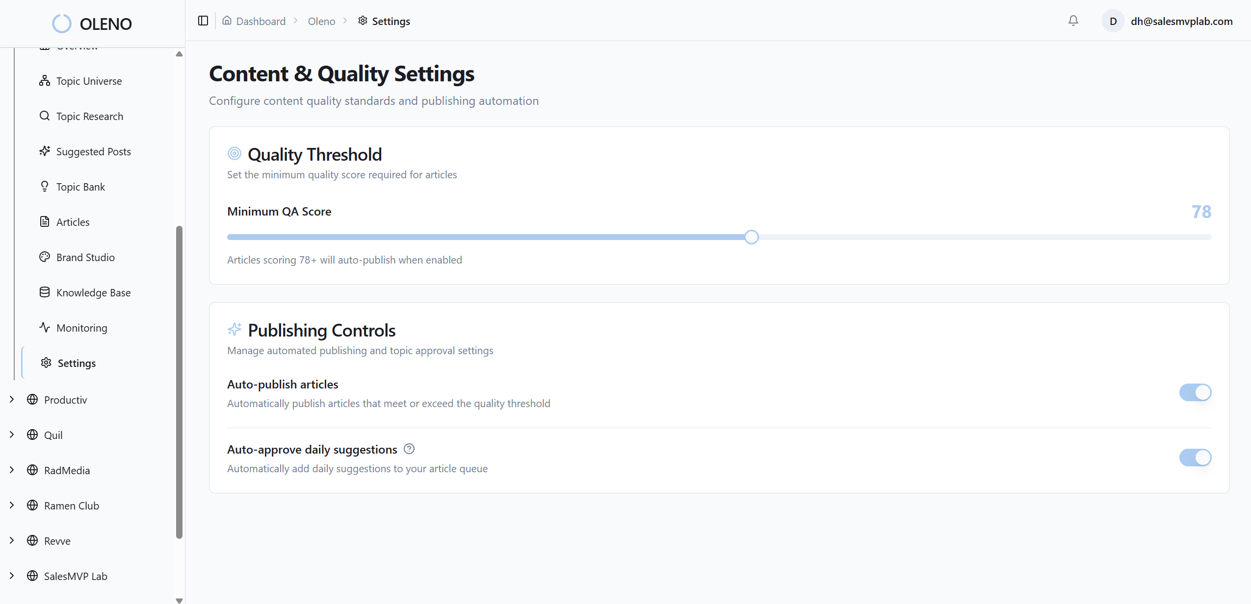
How Oleno Enforces Voice, Product Truth, And Review Without Slowing Releases
Oleno helps small teams operationalize these rules so they ship on-brand microcopy without extra meetings. You define tokens, product truth, and claim boundaries once. Oleno applies them to drafts, patterns, and review gates so the system runs while people focus on tricky edge cases.
Brand voice and writing rules codified as tokens
With Oleno, you define tone, preferred terms, banned phrases, and CTA style once. Oleno turns that into reusable writing rules applied everywhere—from long-form assets to microcopy patterns. Drafts inherit those tokens automatically, which reduces guesswork and frustrating rework when sprints move fast.

Because the rules live in the system, not a doc, voice enforcement doesn’t depend on who’s on the ticket this week. That’s how small teams stay consistent at higher volume without piling on editors.
Product truth and claim control embedded in templates
Load approved product descriptions, allowed claims, and usage boundaries into Oleno. Those guardrails then apply to microcopy templates for errors, permissions, and CTAs, so UI text stays accurate and safe. This connects what shows up in product to the same “product truth” you use across content.
The benefit is practical: fewer late legal edits, fewer escalations, and clearer patterns for high-stakes moments. It won’t remove judgment. It reduces preventable mistakes.
QA gate that blocks off-brand or risky copy before publish
Oleno’s QA gate checks voice alignment, clarity, grounding, and claim boundaries before anything goes live. If something misses the bar, it’s revised automatically until it passes. No manual chases. No hoping someone catches it. This mirrors how teams already want to work—just with enforcement that doesn’t slip during crunch time.

Tie this back to the cost math: fewer inconsistent CTAs, fewer scolding errors, fewer delays waiting on a reviewer. That’s velocity and conversion protected at the same time.
Measurement hooks that fit your current stack
Oleno focuses on execution. You can attach telemetry outcomes—CTA clicks, completion time, error retries—using your existing analytics tools. The advantage is steady, on-brand variants to test and a predictable cadence for updates. Operations stay visible without turning Oleno into a reporting platform.

Want to feel how a rules-first engine changes speed and consistency in a week? Try Oleno for Free.
Conclusion
Microcopy isn’t a copy task. It’s an operational habit. When you shift from opinions to tokens, patterns, and a simple review gate, you get fewer UX surprises and a product that sounds like you everywhere it matters. Start small: map touchpoints, set four tokens, ship ten patterns, and add a gate. Then iterate monthly. The words get better. The system gets faster. Trust follows.
About Daniel Hebert
I'm the founder of Oleno, SalesMVP Lab, and yourLumira. Been working in B2B SaaS in both sales and marketing leadership for 13+ years. I specialize in building revenue engines from the ground up. Over the years, I've codified writing frameworks, which are now powering Oleno.
Frequently Asked Questions